User Research, Service Design, Interface Design
City of Vancouver - Talk Vancouver: Web Platform
At a Glance: my role and contributions!
Role: User Researcher, Prototype Designer, Interaction Designer, Lead User Tester
Tools: Figma, ProtoPie, Illustrator
Team Members: Dalia Alahmad, Jennifer Ho, Karen Lim, Katherin Kim, So Hyun Park
Date: Nov. - Dec. 2018
Contributions: Helped created survey questions and conduct user tests/interviews
Established a user persona and helped create a journey map framework
Created medium to high fidelity interactive prototypes for the mobile web platform
TalkVancouver is a platform that is currently part of the City of Vancouver’s website but is underutilized in its potential as it only offers links to surveys. We proposed to create a service redesign of the TalkVancouver platform so that citizens can reliably find information, receive guidance to voice their opinions and provide feedback with the understanding that they will be heard equally. With increased public consultation, it will help the City of Vancouver make more inclusive urban planning decisions.
Identifying The Problem
Our Stakeholders & Research Methods
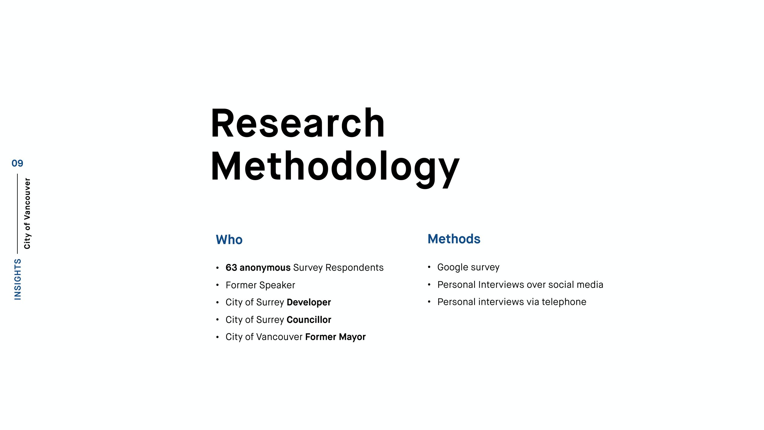
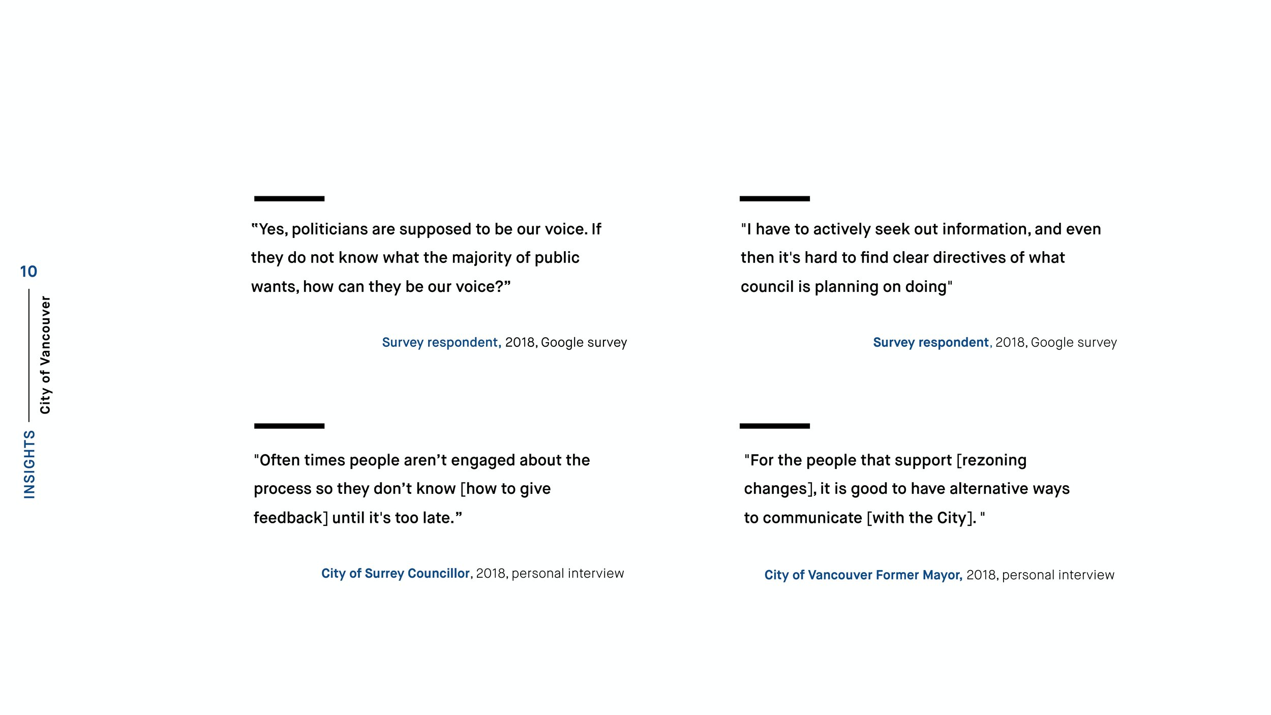
During our researching phase, my team and I created surveys and conducted a couple of interviews. Having done these we were able to identify who our stakeholders were, as well as gain a couple of insights after hearing from them. In more detail, these stakeholders included:
Citizens & Residents of Vancouver
City Developers & Contractors
City of Vancouver’s Mayor
City Council Members
Creating A User Persona
Context: Rezoning Process
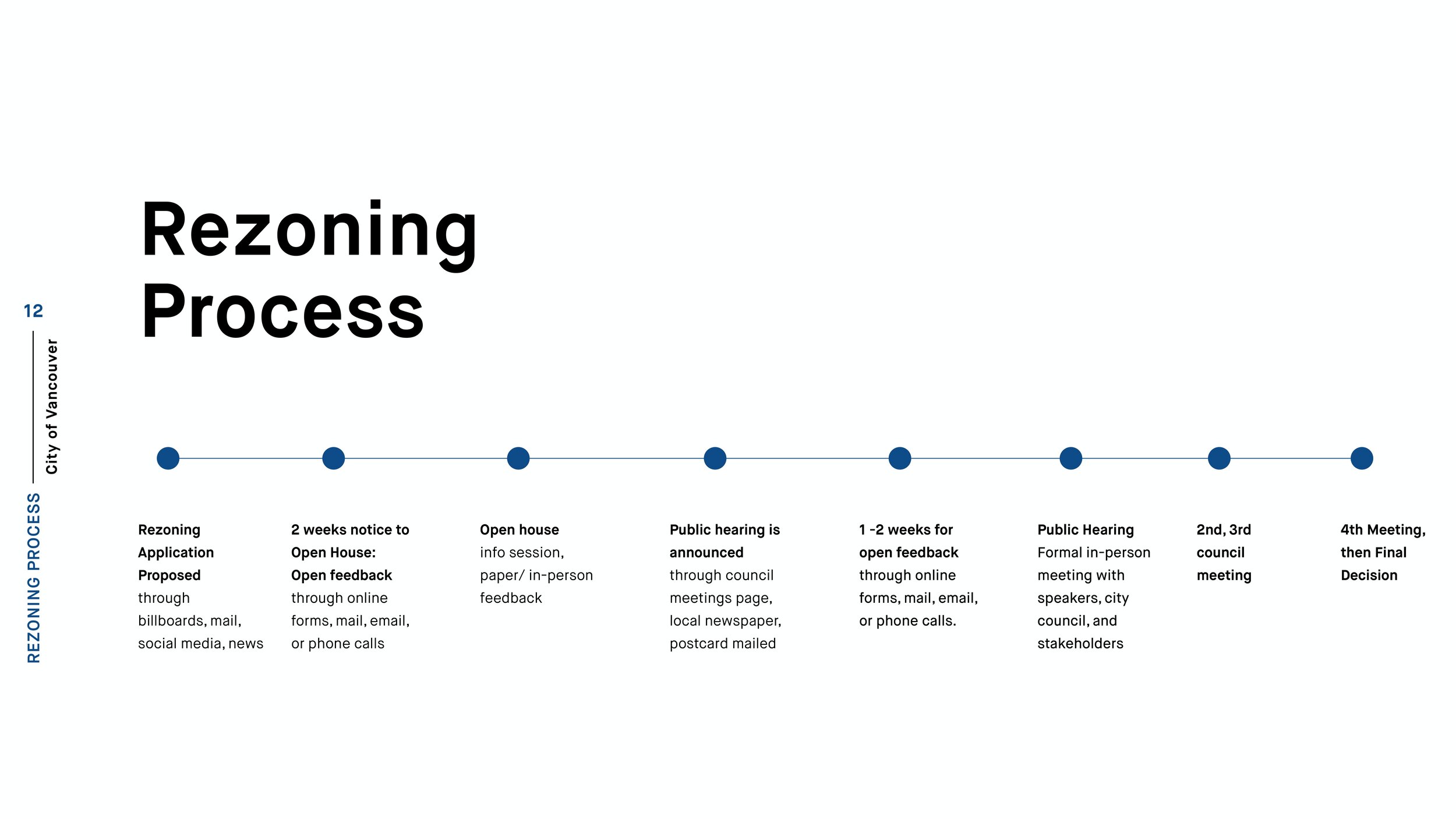
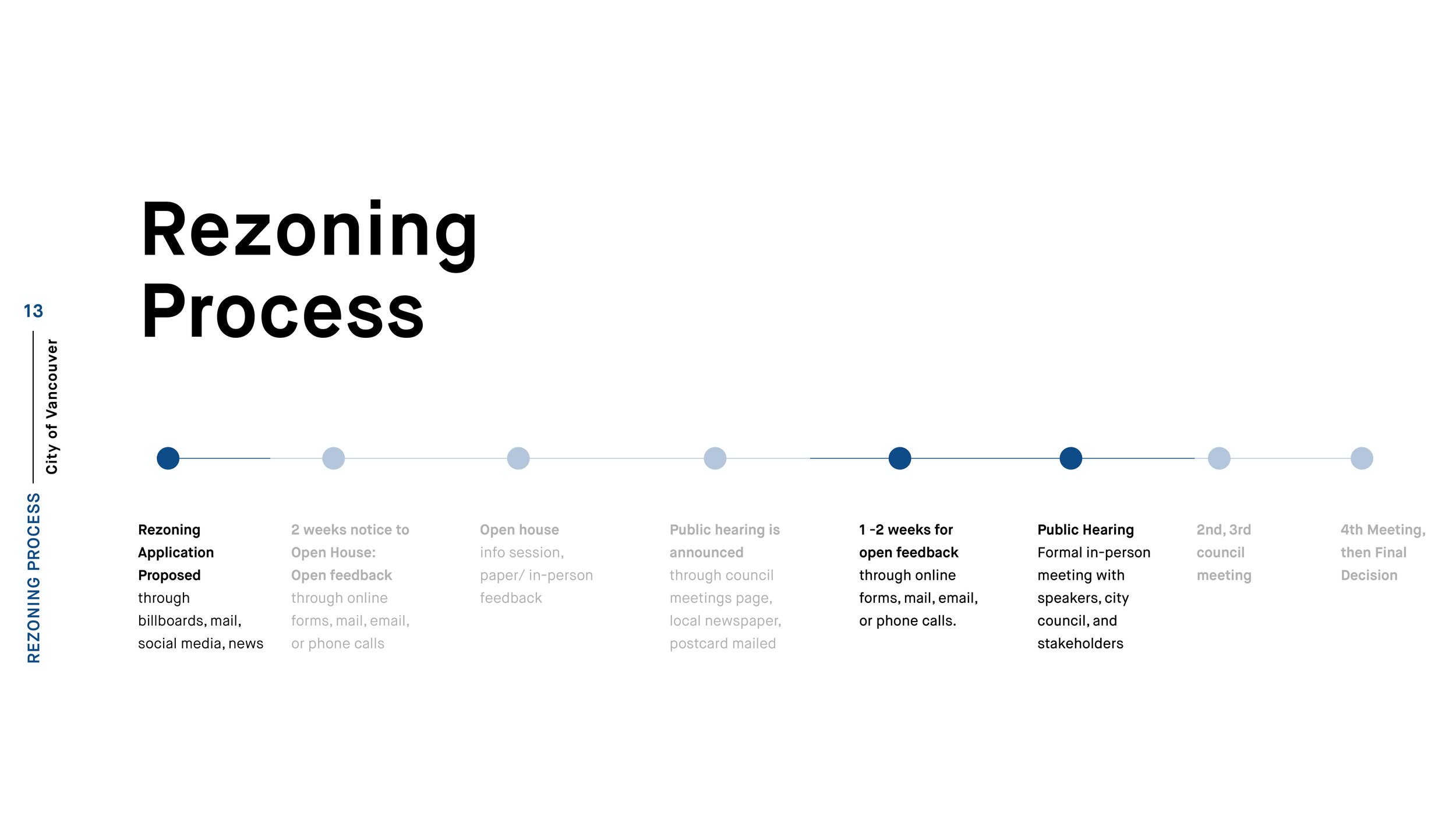
Having identified who we would be designing for and hearing through our interviews about what specifically happens during a rezoning process, my team and I created a general overview of what that process would look like.
Mapping Out Our Users’ Experience
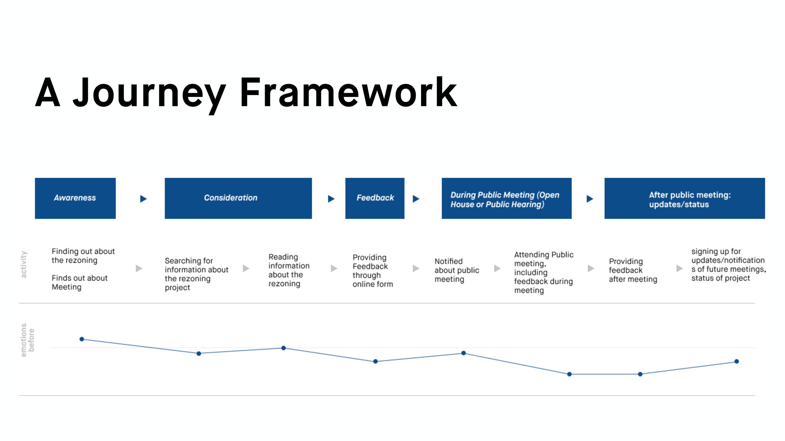
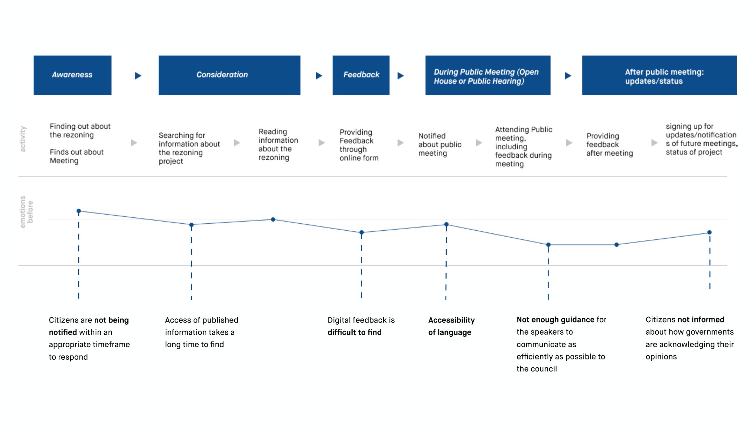
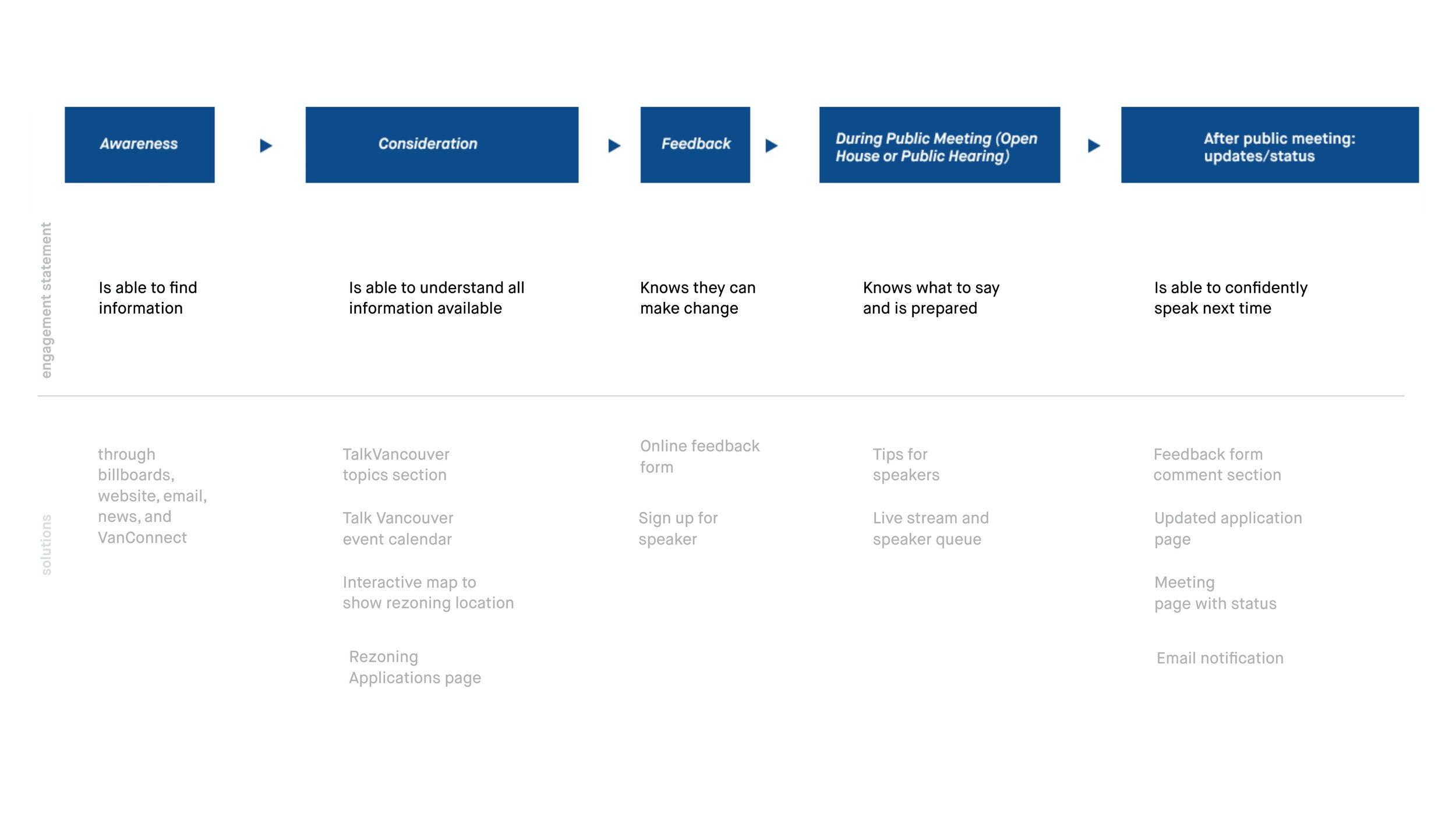
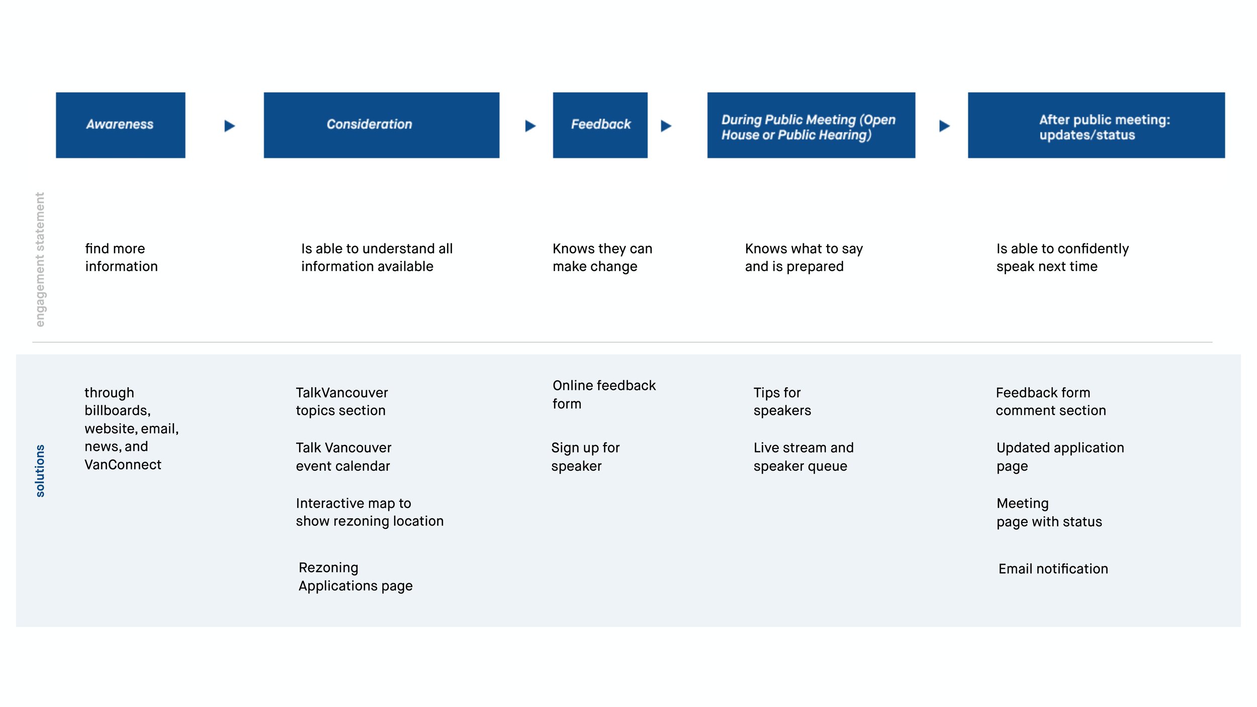
My team and I also created a journey framework that takes into account the different phases of the rezoning process: where citizens like Loretta would find out about a rezoning application, how they would try to find more information, how they would give feedback, and how they would prepare to speak during the public meeting. All of these touchpoints helped us make design decisions that focused on providing a useful tool for potential speakers.
Sitemap & Design Focus
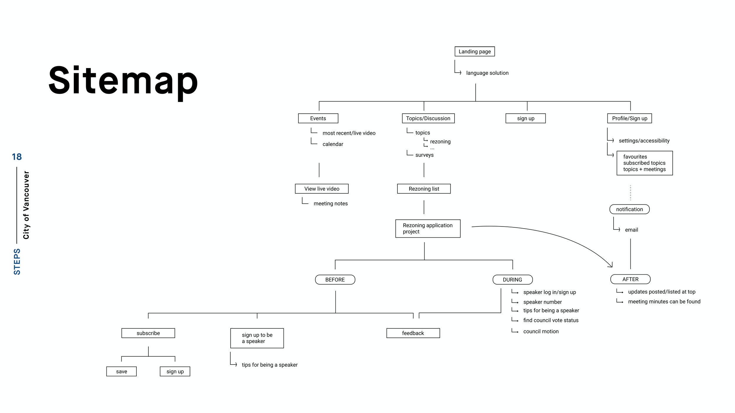
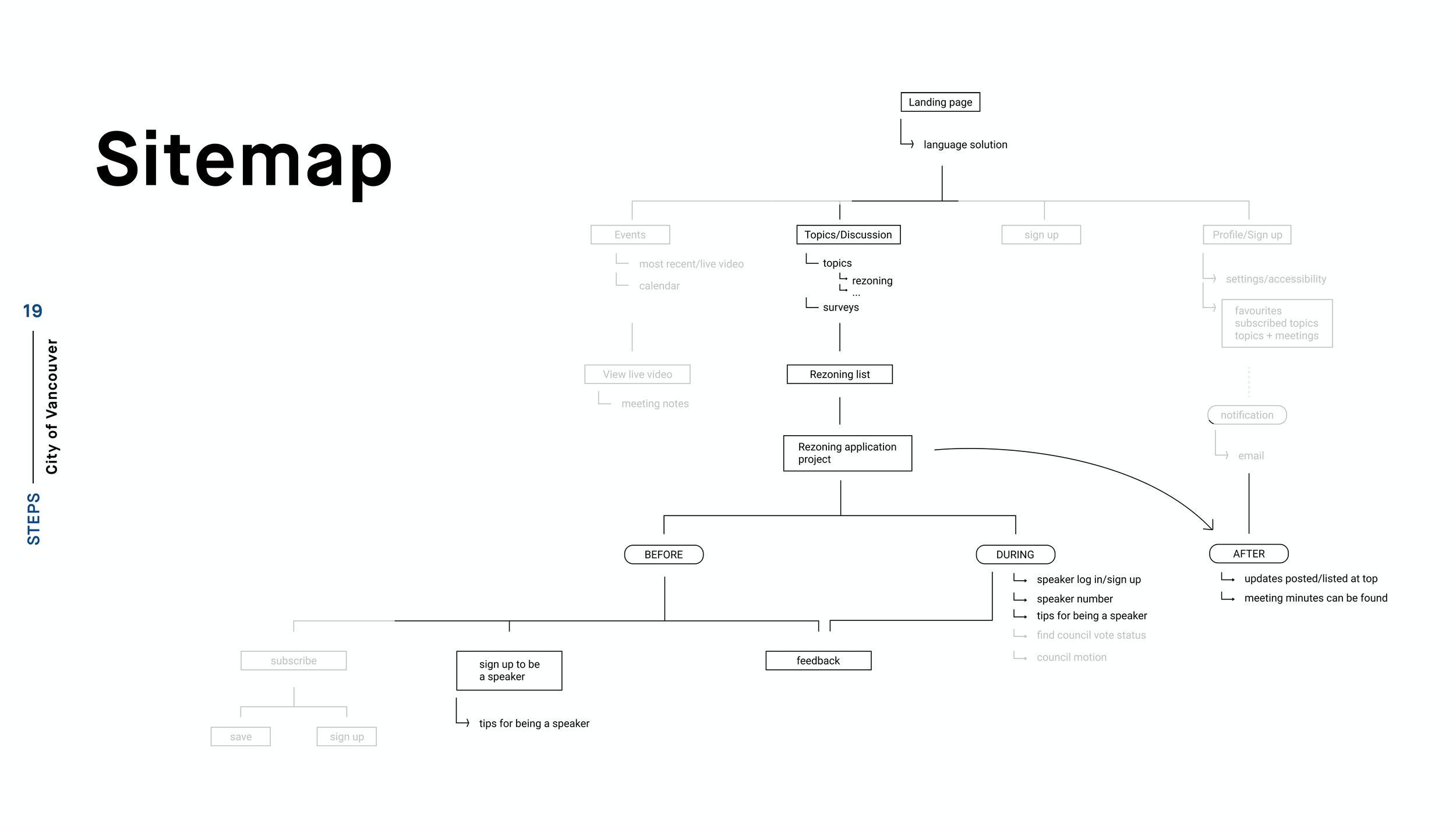
City of Vancouver Experience Pyramid
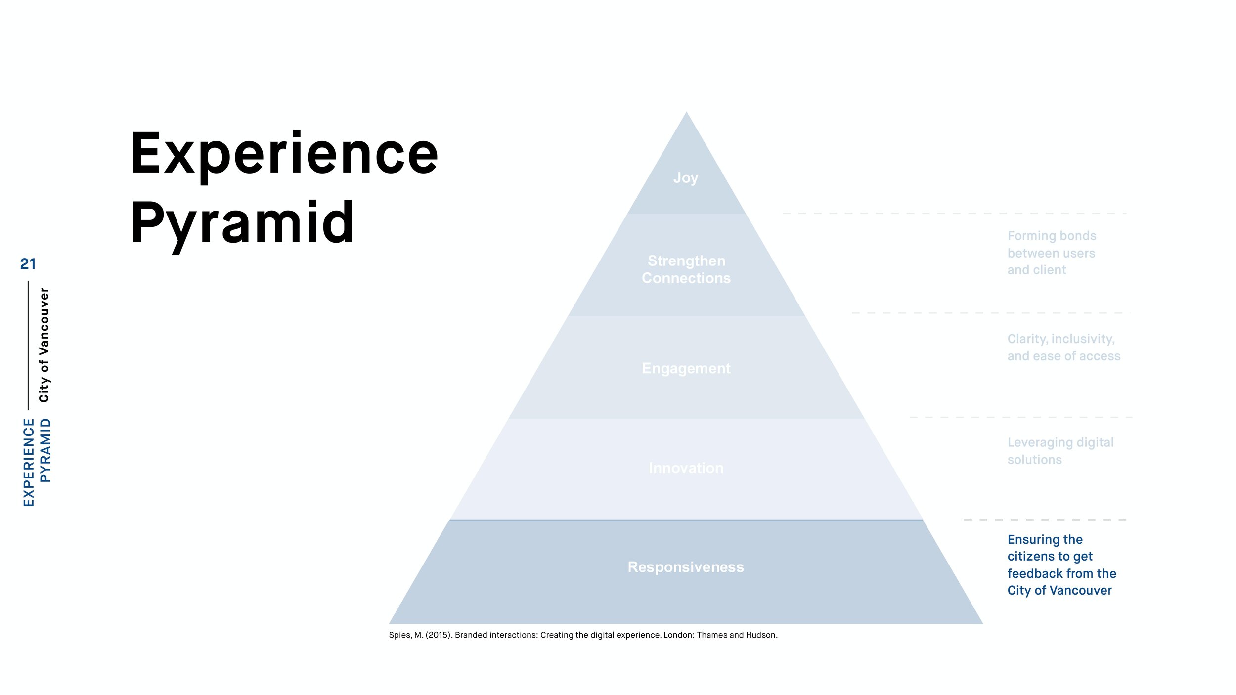
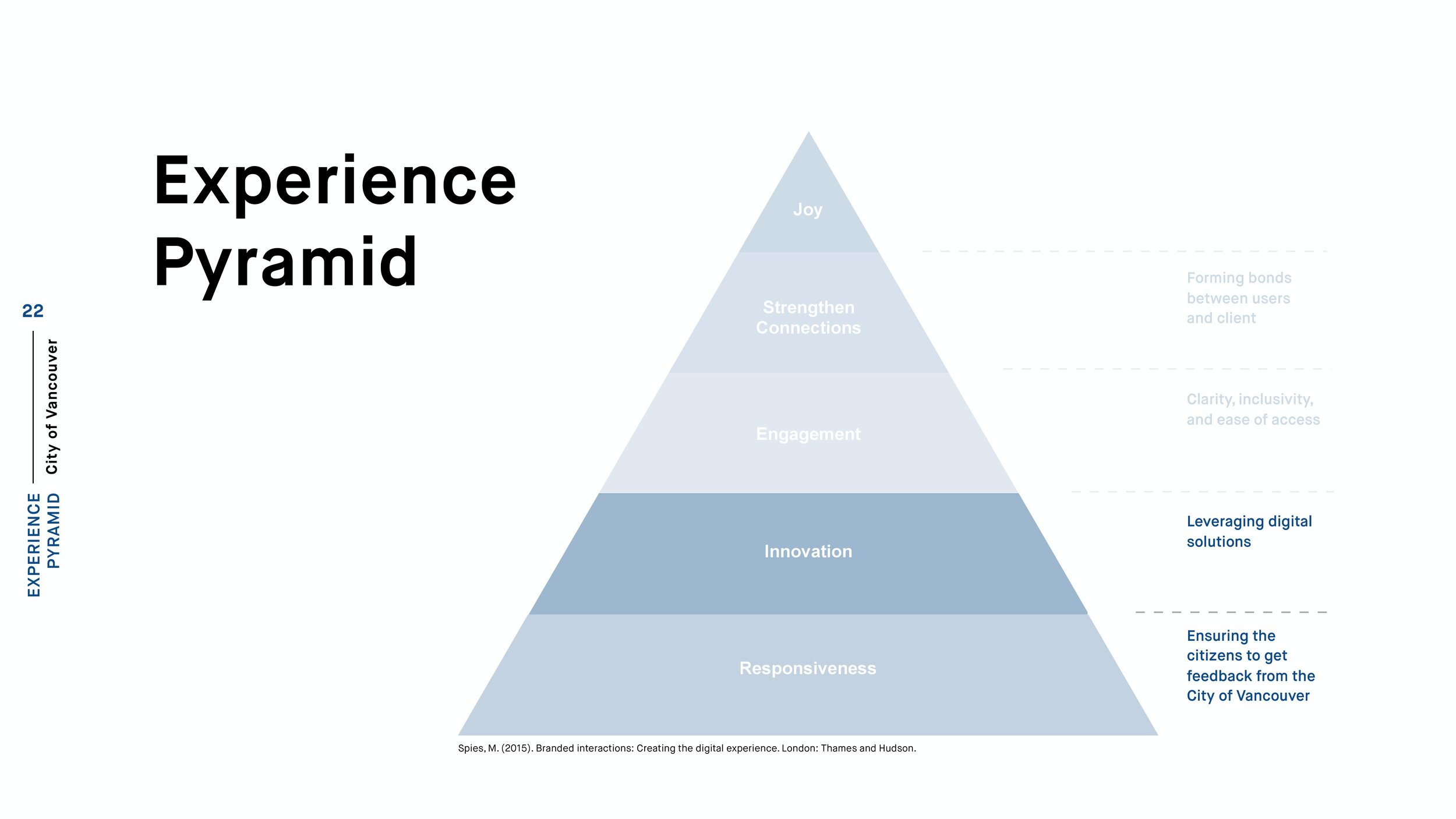
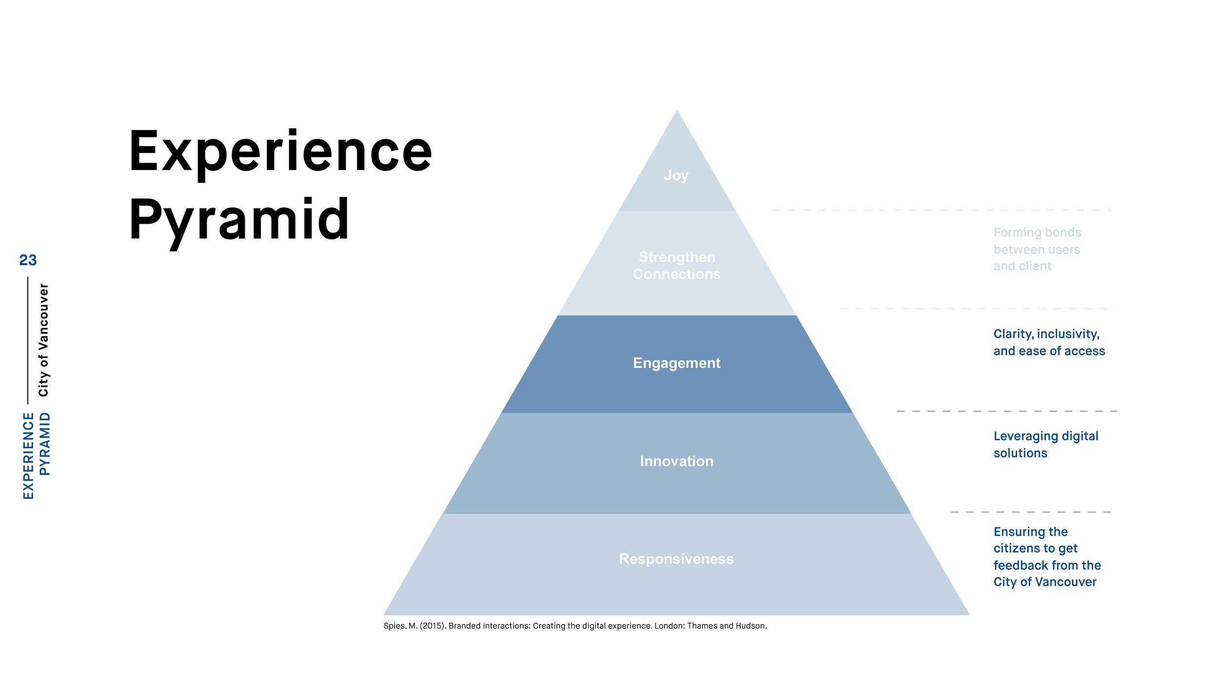
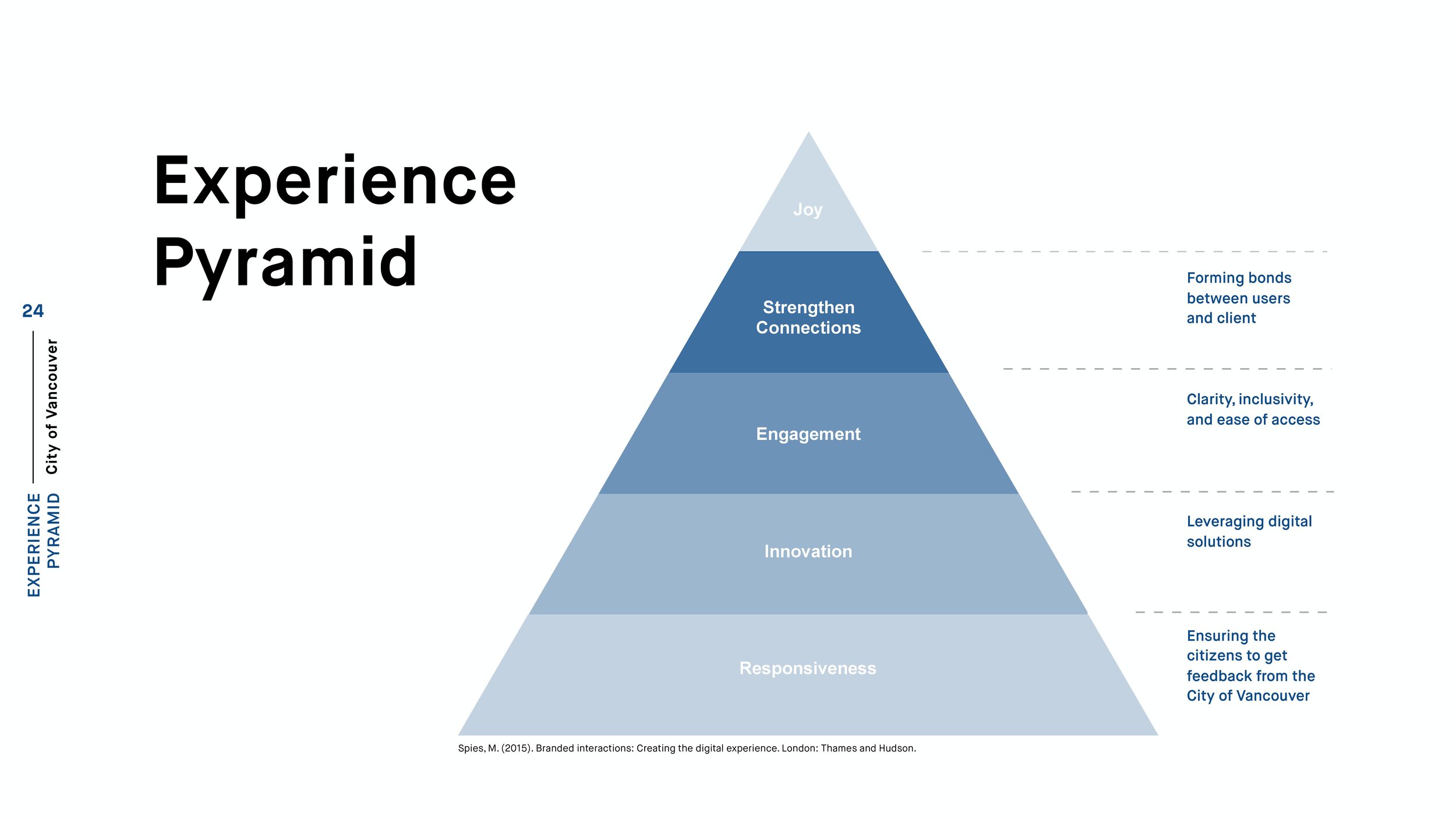
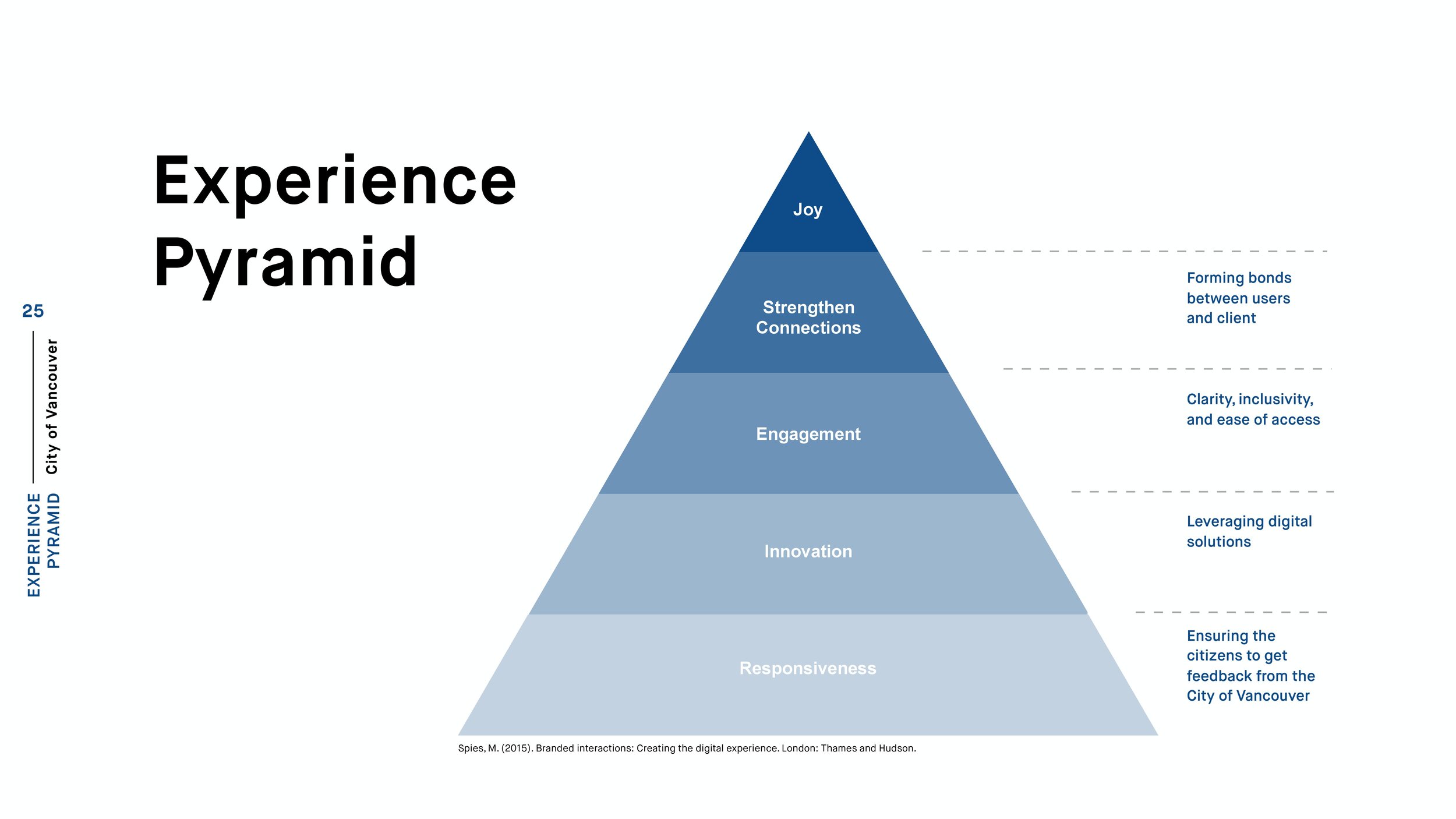
With reference to the UX design pyramid, my team and I chose to create one specifically for the City of Vancouver. In relation to our proposal for TalkVancouver, at the very most basic level, we wanted to bring the value of responsiveness to ensure citizens would get some form of feedback from the City of Vancouver. The next value we wanted to introduce is innovation, showing that the city could leverage the use of digital experiences as a medium to build a connection with citizens. We then build with providing engagement, being clear, being inclusive, and allowing for easy accessibility for the citizens who want to speak up. Together, these would strengthen connections between the city and its citizens, as they work together to solve issues such as rezoning. The team hopes that when each of these experiences is met in the prototype, that a citizen would experience joy or delight in using it.
Design
Design Guidelines
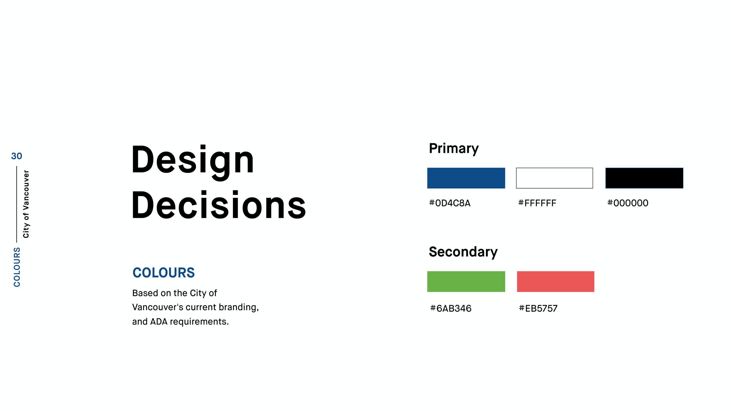
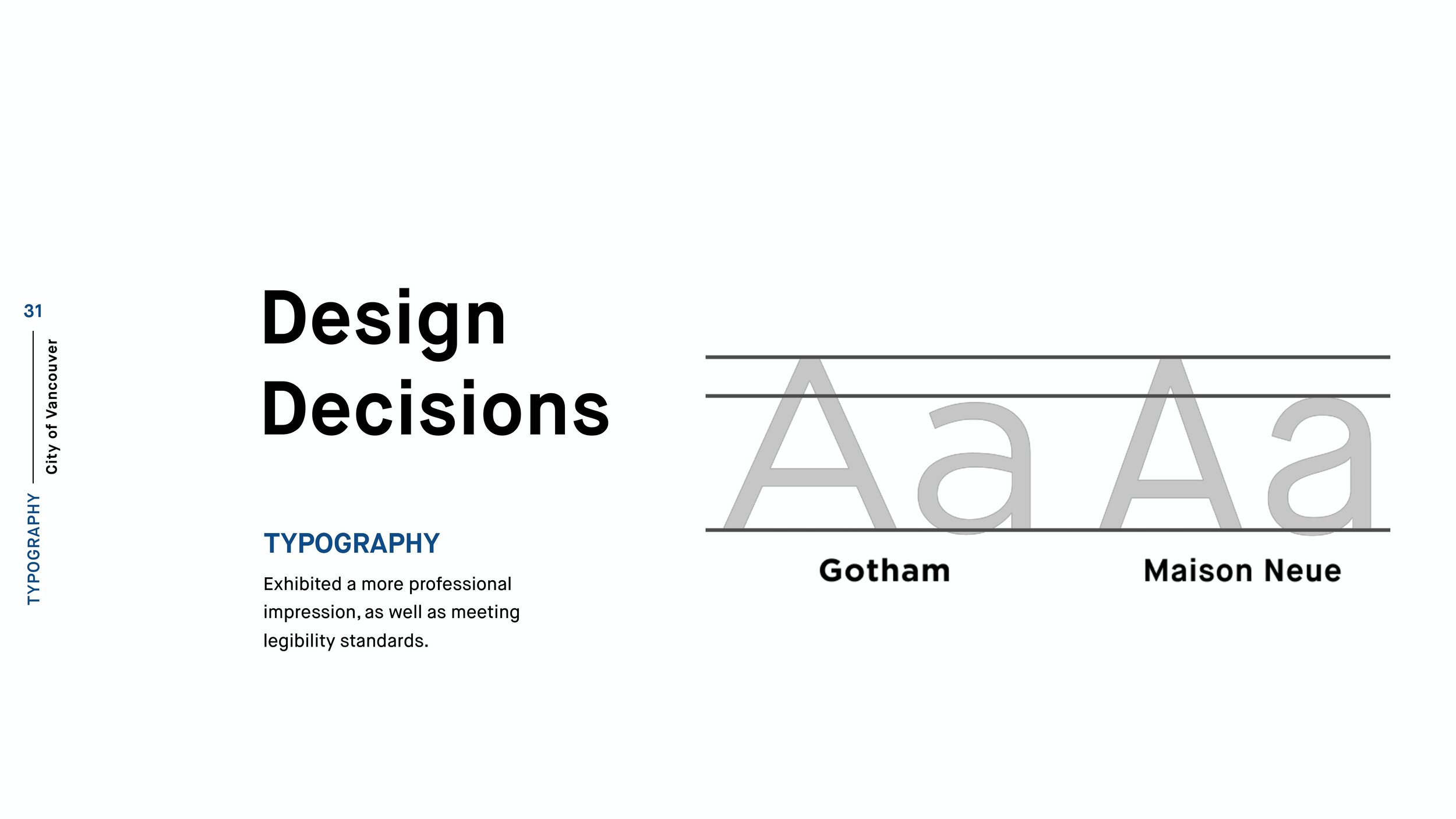
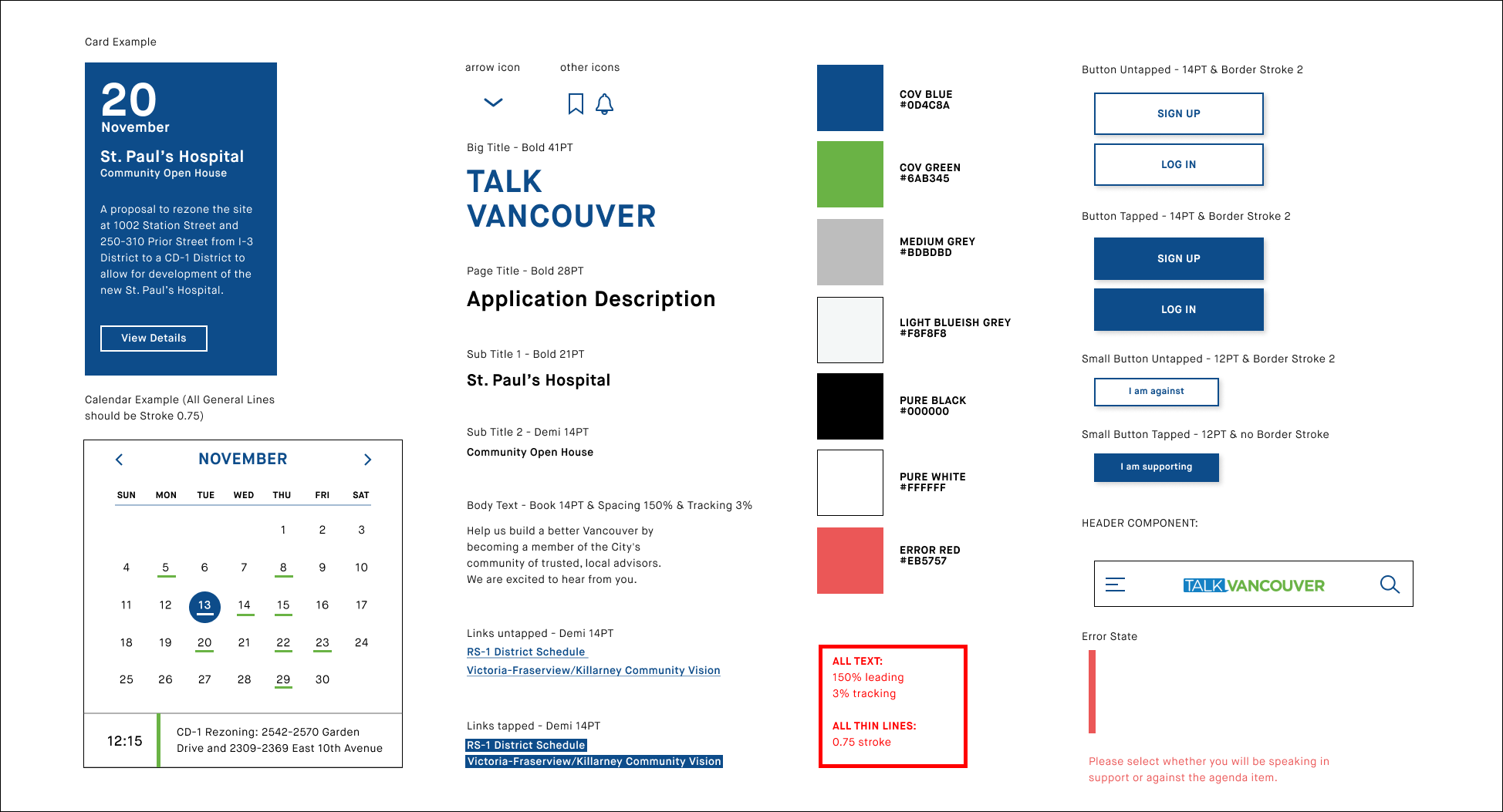
Other contributions that informed our design decisions involved creating a style guide for TalkVancouver. In this style guide, we included things such as the types of buttons, typography, colours, and iconography that would be used to help in the designing of TalkVancouver’s web platform. Moreover, we tried to follow the City of Vancouver’s current style and branding guidelines, but only made a few changes, such the typography or type treatment, to give better reading clarity.
TalkVancouver’s Current Web Platform
With TalkVancouver’s web platform being an extension of the City of Vancouver’s website (visit site), my team decided to move forward with the idea of redesigning it as it is a system that citizens already use in order to give feedback in the form of surveys.
The Iterative Design Process
During the final stages of our project, we got help from industry professionals (IBM Design & Engine Digital) as we made iterations to our journey framework. We received feedback on our interfaces and why we specifically designed those experiences. We then decided to cut down on the number of interfaces we wanted to show as not all of it was necessary for our users to use when attending a public city/council meeting.
Scenario & Application
Interactive Prototypes
1. Landing Page & Specific Topics
Even though our proposal is a web platform for the City of Vancouver, my team and I focused on designing for the mobile version of it. The reason for doing so is for the context of its use, meaning when citizens actually attend these public meetings, they will have a tool that will sort of guide them through the processes of what happens in these public city/council meetings.
For this interface, we introduced our landing page and show specifically how a user could easily access the information they needed for example such as a specific rezoning application proposed by the city.
2. Details of Specific Project In Process
After having gone into a specific rezoning project, the user would then be able to see what things are involved with the rezoning project, and could then see whether or not they want to send online feedback to the City.
Moreover, for this part of the interface, the user will be able to see the status of what process the rezoning project may be at, which is important because, after a certain stage in the process, the city will no longer be taking in feedback.
3. How to Become A Speaker & Tips For Speaking
If the user decides to become a speaker they can now do so as my team and I have implemented the information that a user would need to become a speaker. and when they can become a speaker.
As well, to ensure our speakers have guidance and support when speaking, we’ve also incorporated a section called tips for speakers. This will help users be more clear of what to say when they speak up and give their opinions.
4. Signing Up to Be A Speaker
After seeing what the user needs to do to become a speaker as well as seeing some useful tips on how they can give their feedback more clearly, the user would then proceed to sign up to be a speaker for that specific public meeting.
All they would need is the user’s name, email, phone number if they need a translator, and what they specifically want to talk about during their time. With the thought that many people would want to speak, this was necessary to have as the City of Vancouver wants to hear as many of their citizen’s feedback.
Challenges
During the 4 weeks, my team and I had to finish this project, there were so many decisions that we had to make. Deciding on how we as a team could move forward with our project was a difficult task as we initially kept adding more interfaces that were not needed. However, because of our amazing mentors and getting feedback from industry professionals, we were able to prioritize what was actually necessary.
Final Thoughts
Having worked on a service design project was very tiring but also very rewarding. As a designer, it was really cool to see how our project started, not necessarily knowing how the project would turn out in the end. However, reflecting on all the decisions we made, many of the assumptions we validated, and seeing how our design could affect the lives of people was a real big motivator for me. The one main thing I want to take away from this experience is the idea of being empathetic, and it is something I believe all designers should have as we are designing for people and not necessarily ourselves.
© John Latay 2021
