
User Research, User Experience, Interface Design
Grocery Express: Mobile Companion Application

At a Glance: my role and contributions!
Role: Content Creator, Prototype Designer, Interaction Designer, User Tester
Tools: Figma, ProtoPie, Illustrator
Team Members: Karen Lim, Katherine Kim, Leona Yu, Ola Alsukour
Date: July - Aug. 2018
Contributions: Conduct preliminary research as well as a couple of user tests
Establish a user persona and helped create the user journey framework
Create low-high fidelity wireframes and finalized the style guide
Grocery Express is a mobile companion application for people who shop for groceries, which aids users in creating grocery lists, price estimating them, and locating items in the store using an interactive indoor mapping system. The purpose of creating this mobile application was for the convenience that shoppers could have, which is to check and compare prices, view items on sale, and creating a digital grocery list.
Searching For An Opportunity
Research & Survey Summary
Before our team had a design focus, some research was needed to validate our assumptions about grocery shopping. With a survey that I took part in to make, my team and I were able to gain valuable information such as what things people look for when they shop, if people still use a grocery list, and any bad experiences they may have while shopping for groceries. As well, pushing out this survey and getting 51 responses, my team and I were then able to narrow down on a specific target audience that we wanted to design the mobile application for.
Our User Persona
With the research we gathered from our surveys, we found out that our target audience and chosen persona was best represented as a mother, and as an intermediate user, meaning they are quick to learn how the technology works. It made the most sense for our persona to be a mother because they are focused on their family, want to efficiently find items without having to look through multiple aisles, and want to save money and time without having to visit other grocery stores or supermarkets.
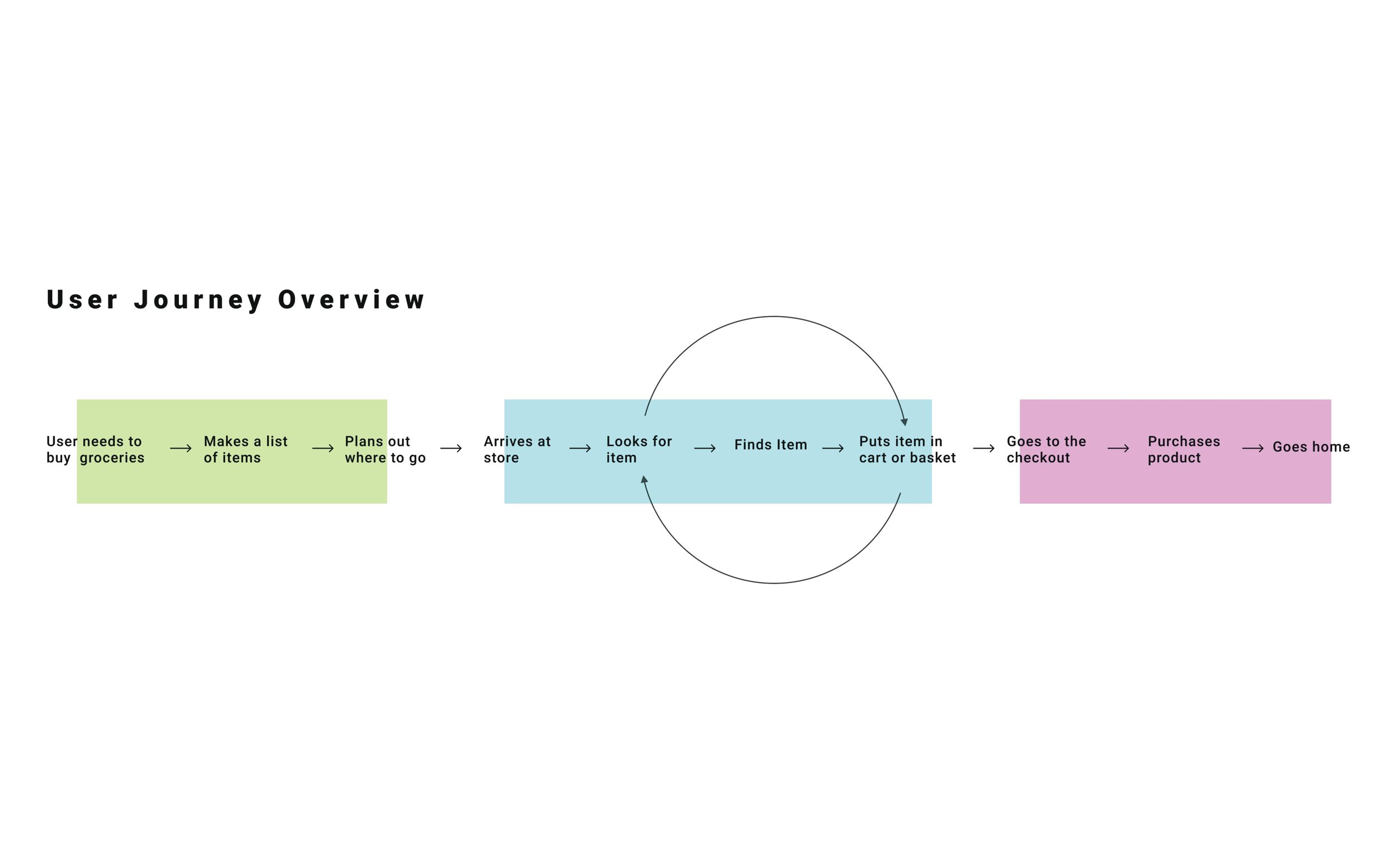
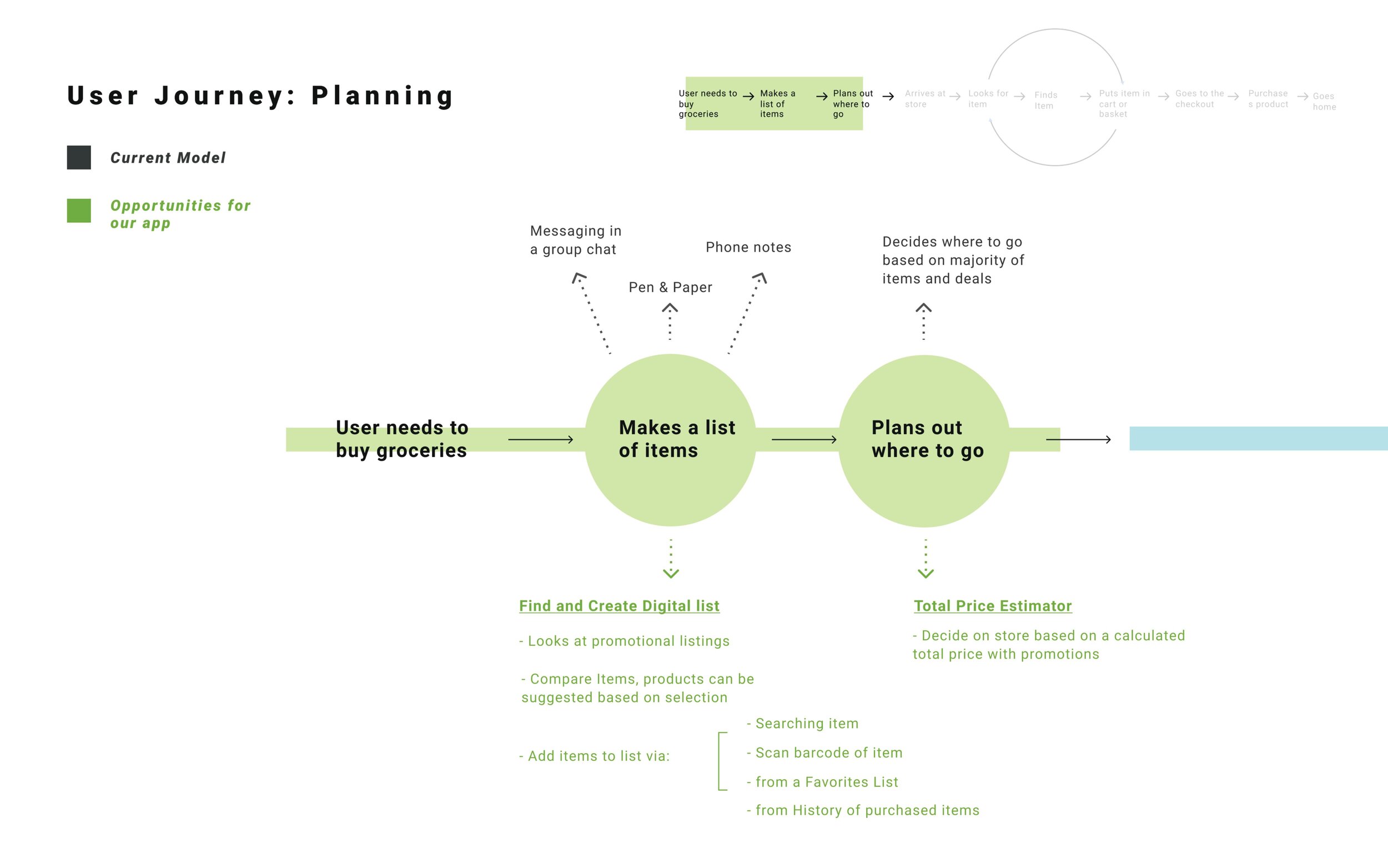
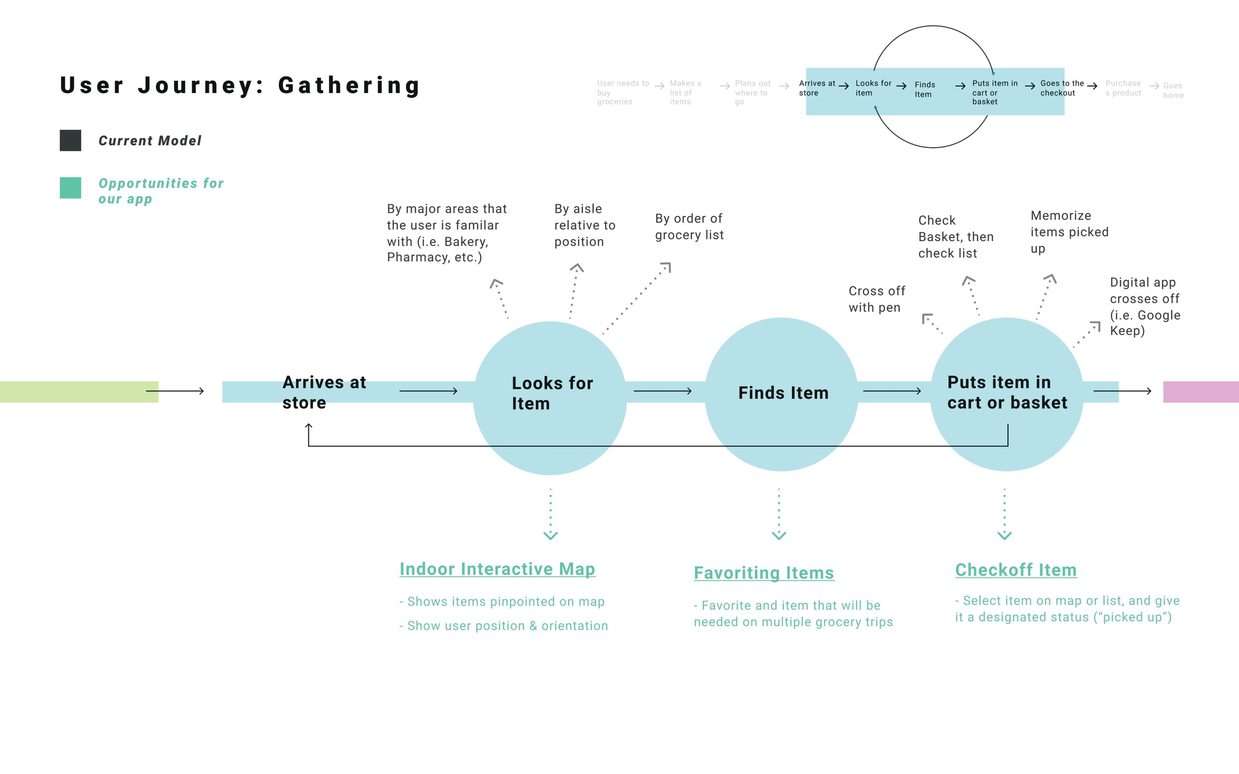
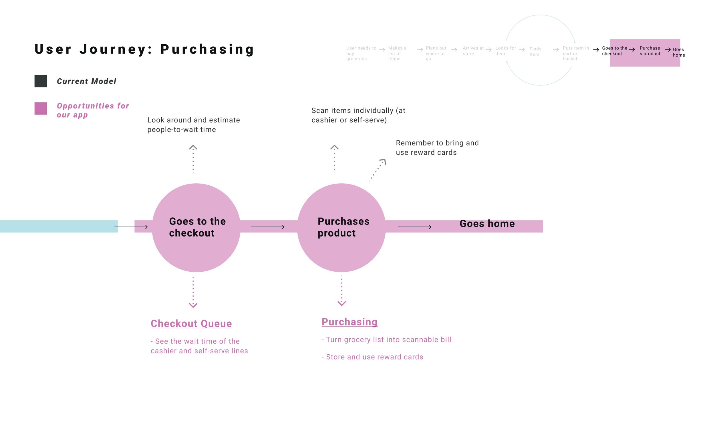
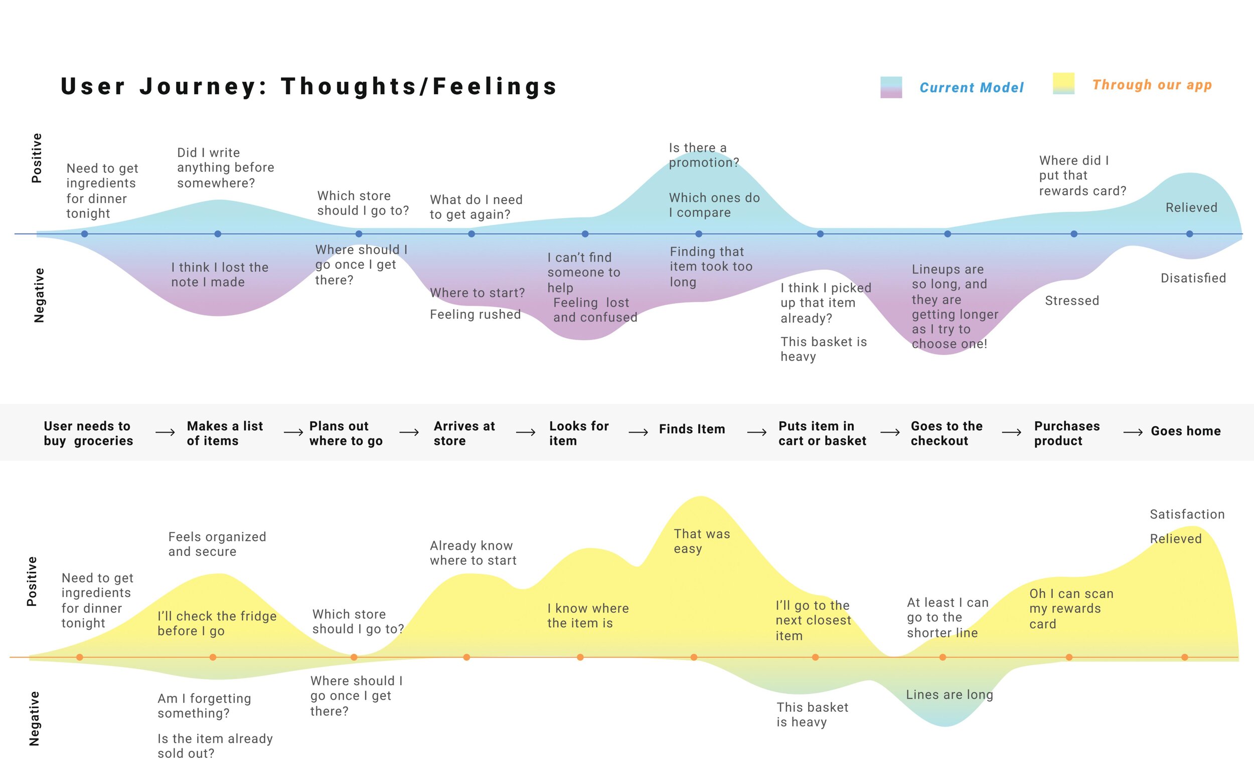
User Journey Map
Design
Greybox Prototype Wireflow
Having touchpoints within the 3 phases of our user journey map, we were able to create a low fidelity sitemap or wire flow that is composed of 6 sections. These sections account for the main navigation, login/signup, creating a list, an interactive map, and rewards cards.
Finalized Style Guide
After creating our wire flow with annotations, we started to finalize our design as we made a style guide that incorporated our branding, use of colours, typography, buttons, and other items such as form fields and our main navigation bar. What informed these design decisions involved trying to engage and entice our target audience through the use of bright and saturated colours, and with high crisp quality images.
Usability Testing
Having 9 users do usability testing for us we were able to identify where our mobile application was doing great and where there may still be issues with either the design, the copywriting, and with the overall interface itself. During these usability tests, my team and I had recorded actions and discussed their thoughts and feelings towards the app. Our predictive evaluation involved a consultation style testing with the company SAP where correspondents gave feedback, advice, and tips as they went through each part of the app. Overall, the feedback was very helpful as we used them to make final iterations of our interactive prototypes.
Interactive Prototypes
Browse By Closest Store or by By Category
One of the main features of this app is browsing items for different stores. This allows customers to save time, gas, and money, by comparing prices without having to drive between stores or remember pricing in other supermarkets.
For this feature specifically, we focused our design thinking around the idea of having filters, tabs, and menus. The challenging part here was making sure the design didn’t feel too cluttered as it could overwhelm the user.
Price Estimate Grocery Shopping Quick List
Another feature my team and I designed is a price estimator for the user’s grocery list. This allows users to generate a list of items from different stores and see the pricing altogether before even arriving at the stores.
This benefits users by no longer having to do the calculations for each item and store that they wish to shop at. Moreover, it may even help those who are looking to budget their expenses.
Indoor Mapping System Item Finder
This third feature that we’ve implemented in our mobile application is an item finder. With this feature, it acts as a navigator to help the user find the specific item they are looking for on their list.
As a bonus, this feature also allows the user to see if there are any promotions that are being offered by the store or supermarket. This would be beneficial for users who have never been to the store before or are too shy to ask for help.
Storing Reward Cards & Keeping Track of Points
The last feature my team and I designed is a section for storing the user’s rewards cards. In this feature, the user can simply take a photo of their rewards cards and add it to an existing list of other reward cards.
Once the reward card(s) is added to the application, the user can then keep track of their points and pull them out anytime they grocery shopping. Users no longer have to carry around their reward cards as they could to lose them.
Challenges
Through the entire span of this project, there were many challenges I personally faced. These challenges involved creating a journey map for our specific persona, creating an interface that had a sense of uniformity throughout the entire application, and identifying things such as whether or not it was appropriate for the user to have to create their own personal account. Having said this, because we were able to push out surveys, do usability testings, and receive feedback from our peers, professor, and industry experts, it improved the quality and design of our application and has even gotten me to ask questions I wouldn’t normally ask myself.
Final Thoughts
Understanding what work needed to be done before even designing an interface or an application was a crucial learning point for me. Working on this project helped me understand the design principles needed to be able to design an interface, which started with creating low fidelity wireframes, transitioning them into a sitemap/wire flow, making a style guide, and refining until the very end. Overall, this was one of the projects I enjoyed working on the most, learning many design methods that I can apply in the field of user experience and user interface design.
© John Latay 2021