Market Research, User Research, Interface Design
OpeNest: Mobile Application for Roommates


At a Glance: my role and contributions!
Role: Content Creator, Market Researcher, User Researcher, Prototype Designer
Tools: Figma, Adobe Illustrator
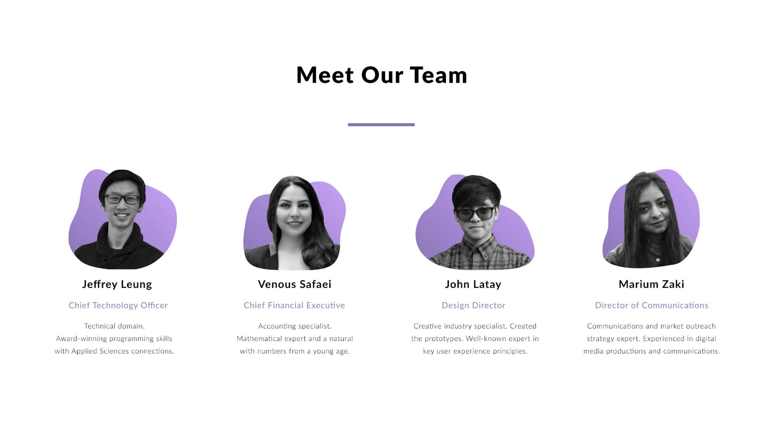
Team Members: Jeffrey Leung, Venous Safaei, Marium Zaki, Nijhum Mohammad
Date: Jan. - Apr. 2020
Contributions: User and market research through surveys and interviews
Persona Creation for the different users we aim to target within a specific market
Creating low-high fidelity wireframes and mockups with initial sketches
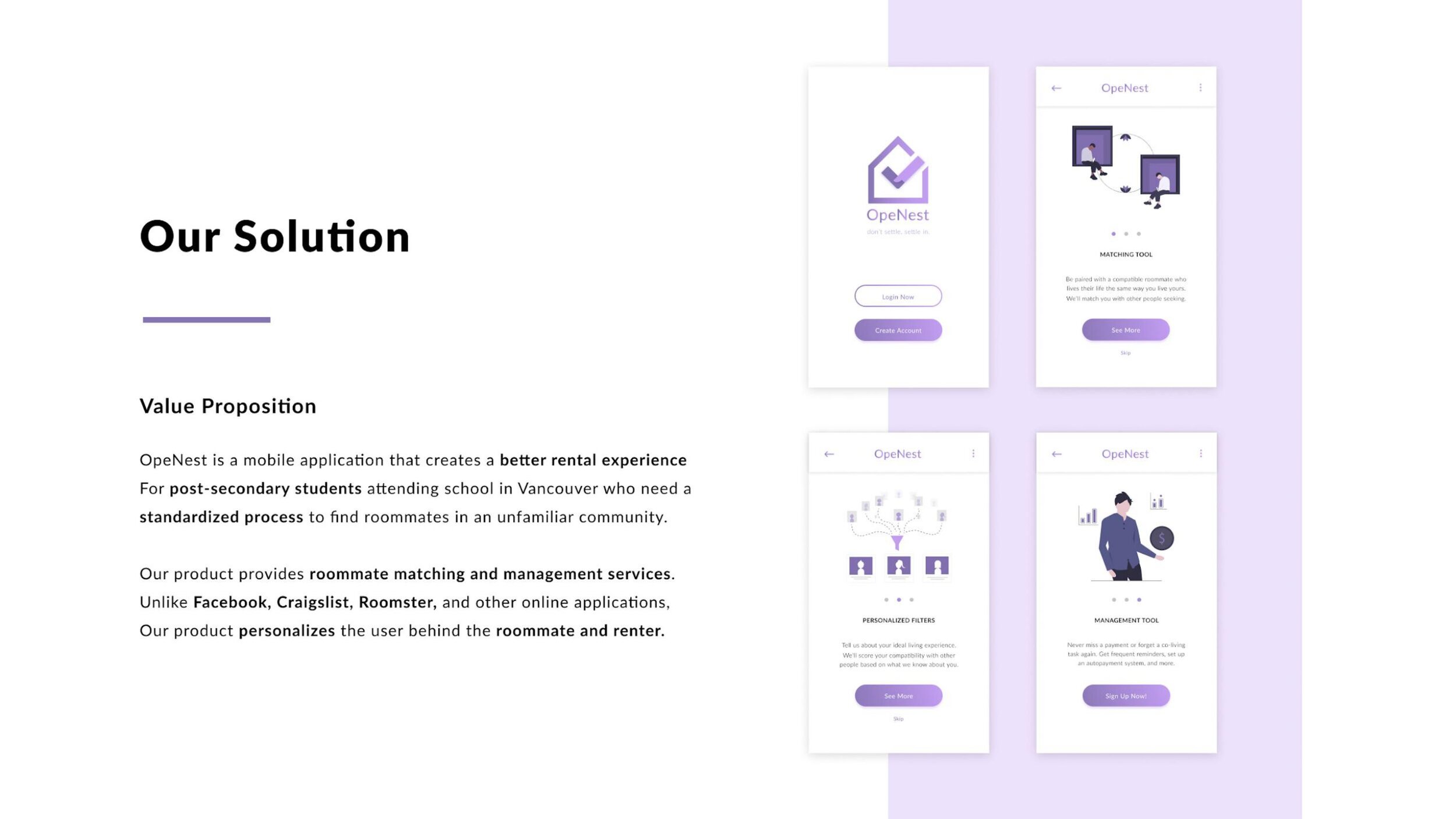
Value Proposition
OpeNest is a mobile application that creates a better rental experience for post-secondary students attending school in Vancouver, who need a trusted and supportive process to find roommates in an unfamiliar community. Our product provides roommate matching and management services. Unlike Facebook, Craigslist, Roomster, and other online applications, our product personalizes the user behind the roommate and renter throughout the rental experience.
Vision Statement
Our vision involves helping those who are in need of a simpler and more convenient way for finding roommates or tenants. We plan on achieving this by creating a product that focuses on our users’ needs and by incorporating key user experience methodologies to ensure joy in the use of our mobile application.
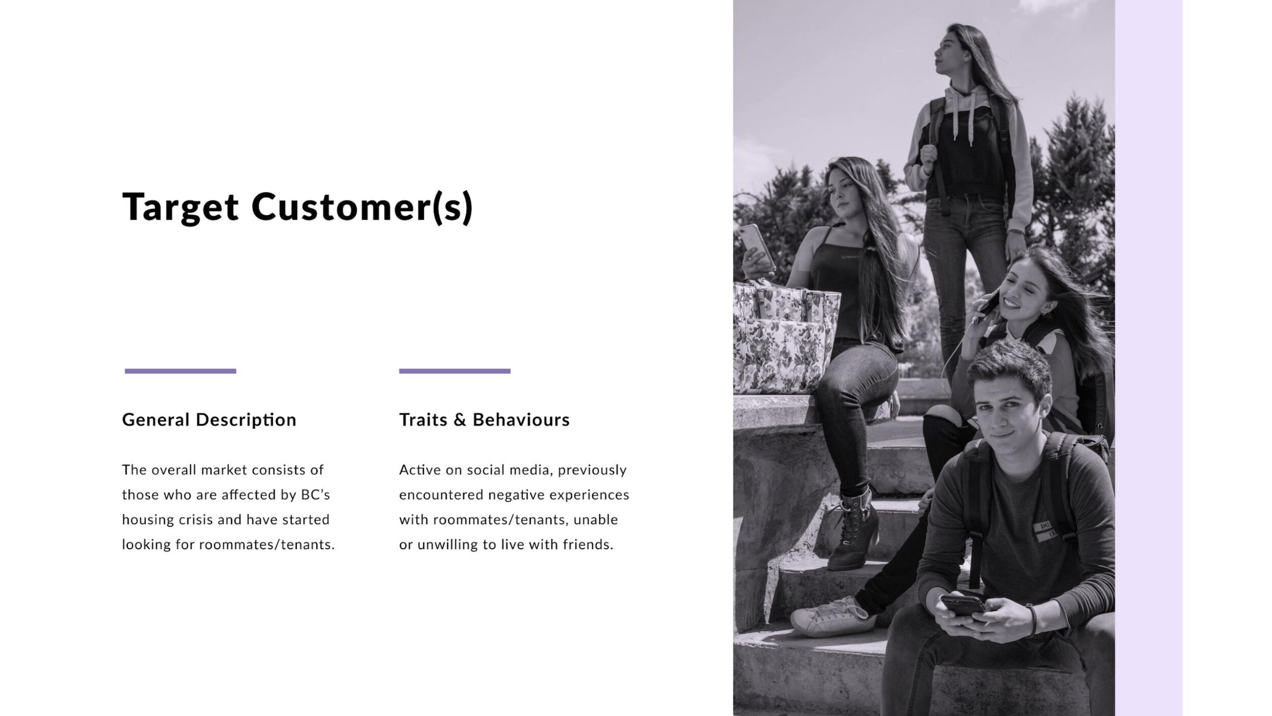
User Research: Identifying The Problem
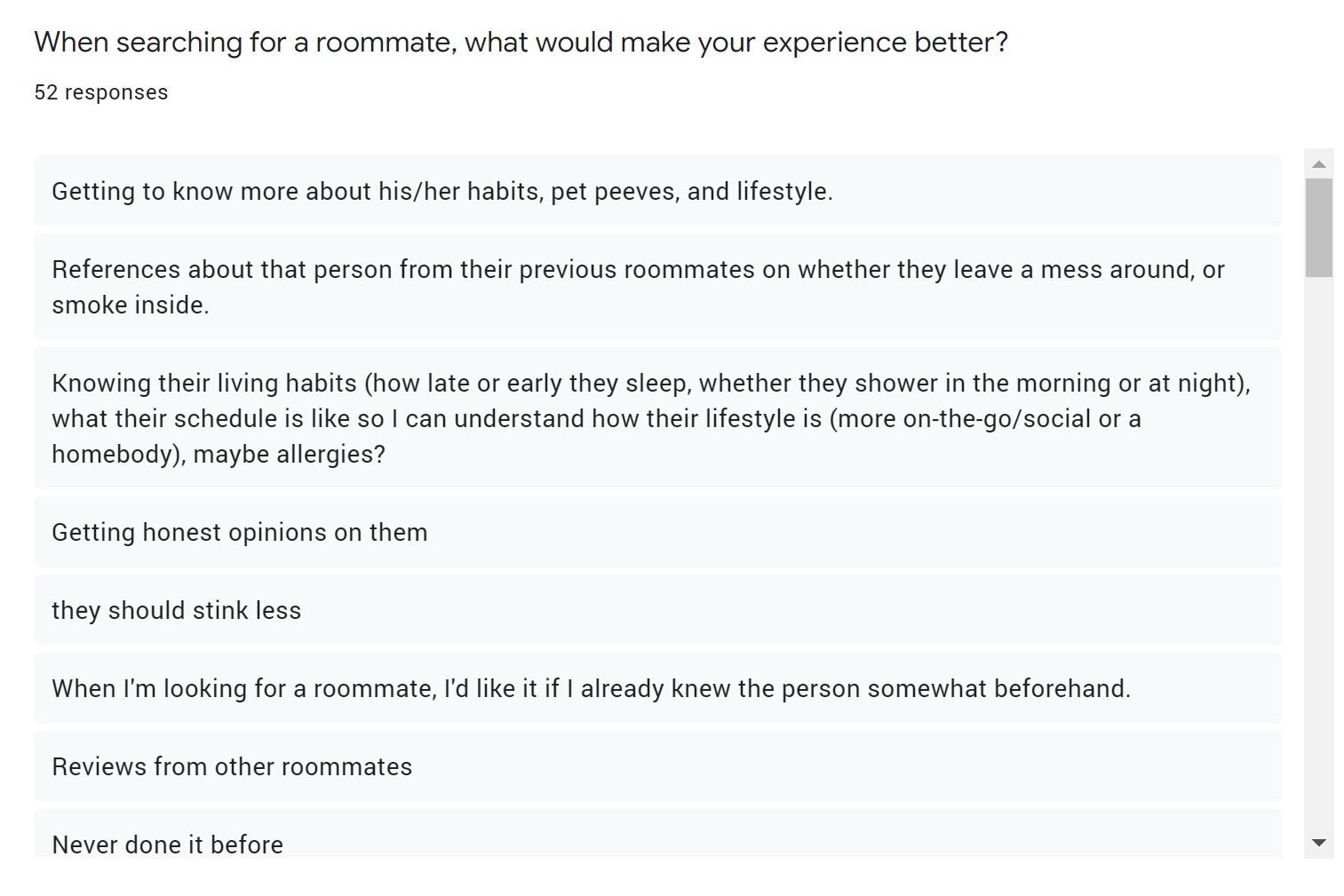
Survey Responses
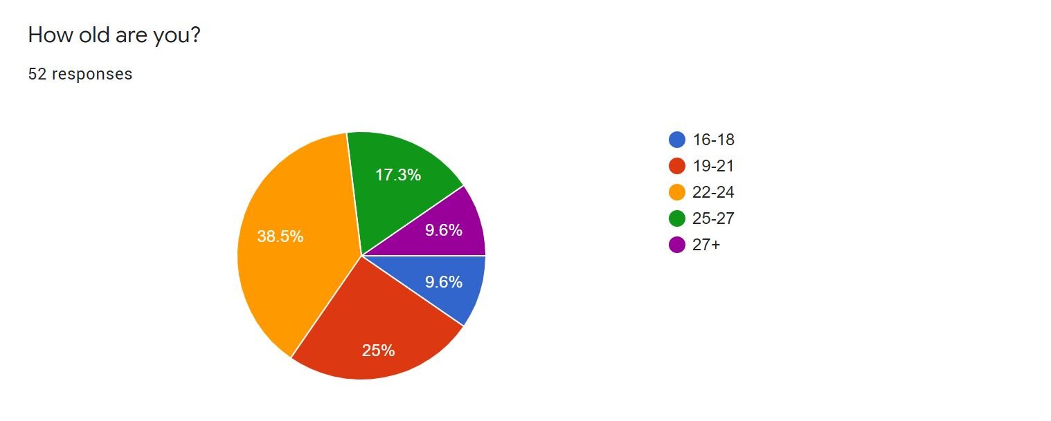
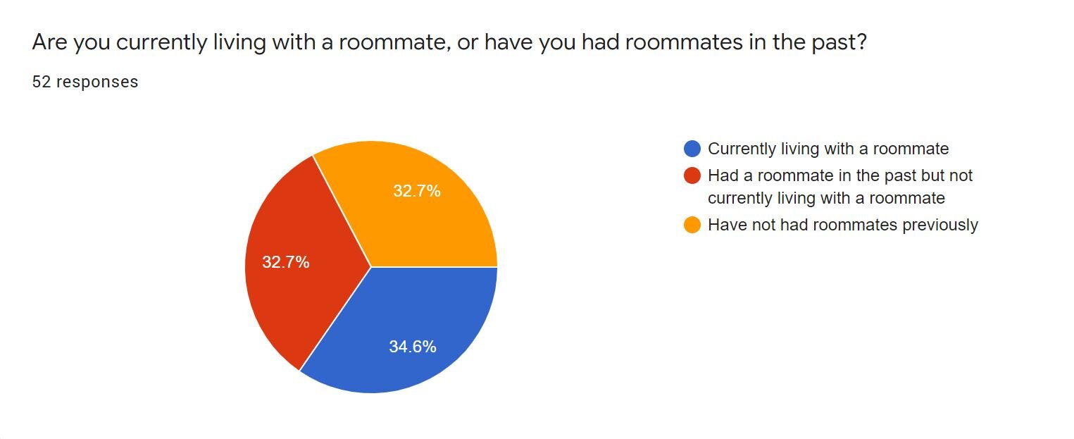
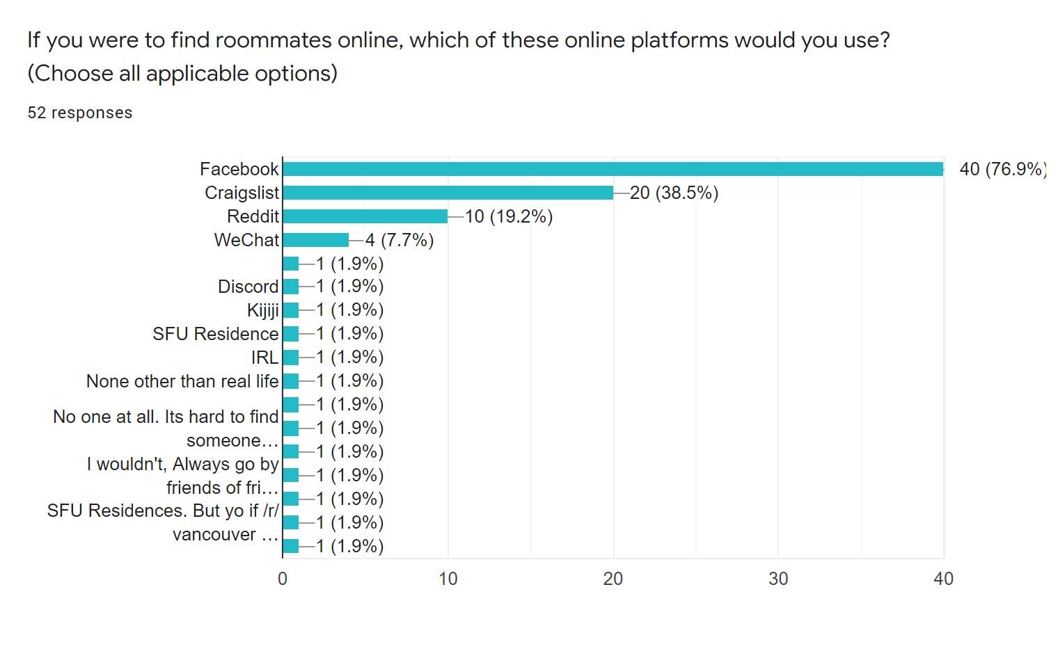
After having received several responses from our surveys, we have identified a few key factors that illustrate the current problem, who is involved, and what users are currently using to solve the problem of finding a roommate. For example, from our survey respondents, it was really apparent that the majority of them were using Facebook as an online platform to look for roommates. Having said this, Facebook does not currently have anything implemented for those who want a more personalized way to find roommates.
Interview Responses
Apart from pushing out surveys, my team and I had also conducted a series of about 25 interviews that were done over the phone, in-person, and online video calls. By doing this, the problem of users not being able to find the right roommate became more clear to us. For example, one of our interviewees stated they found it such a waste of time to be browsing through several online platforms that the majority of the time was not even reliable.
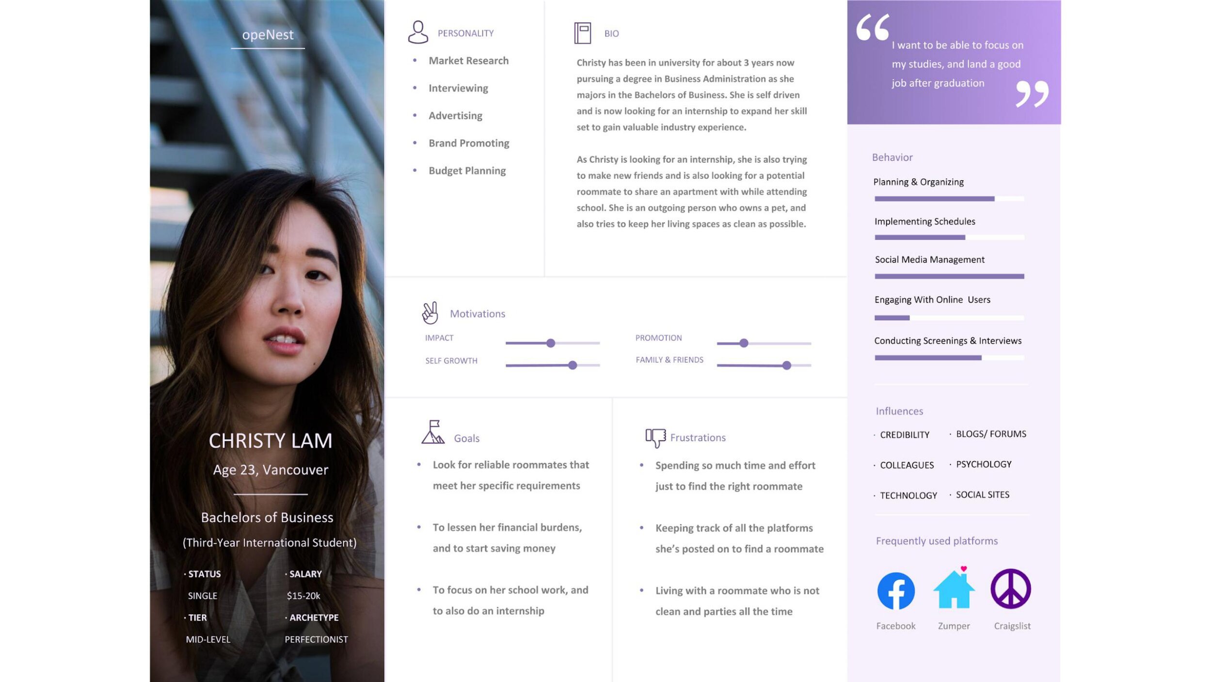
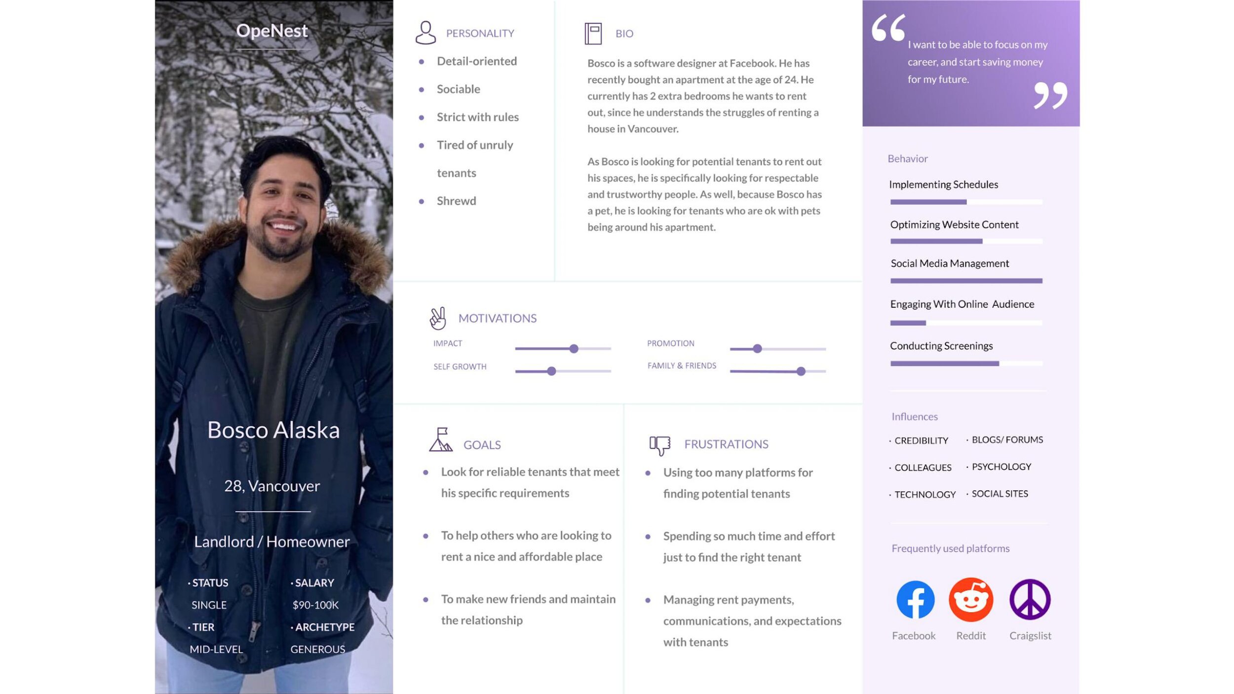
User Persona
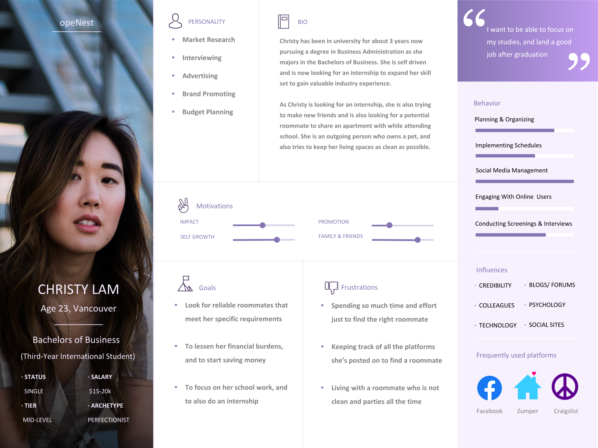
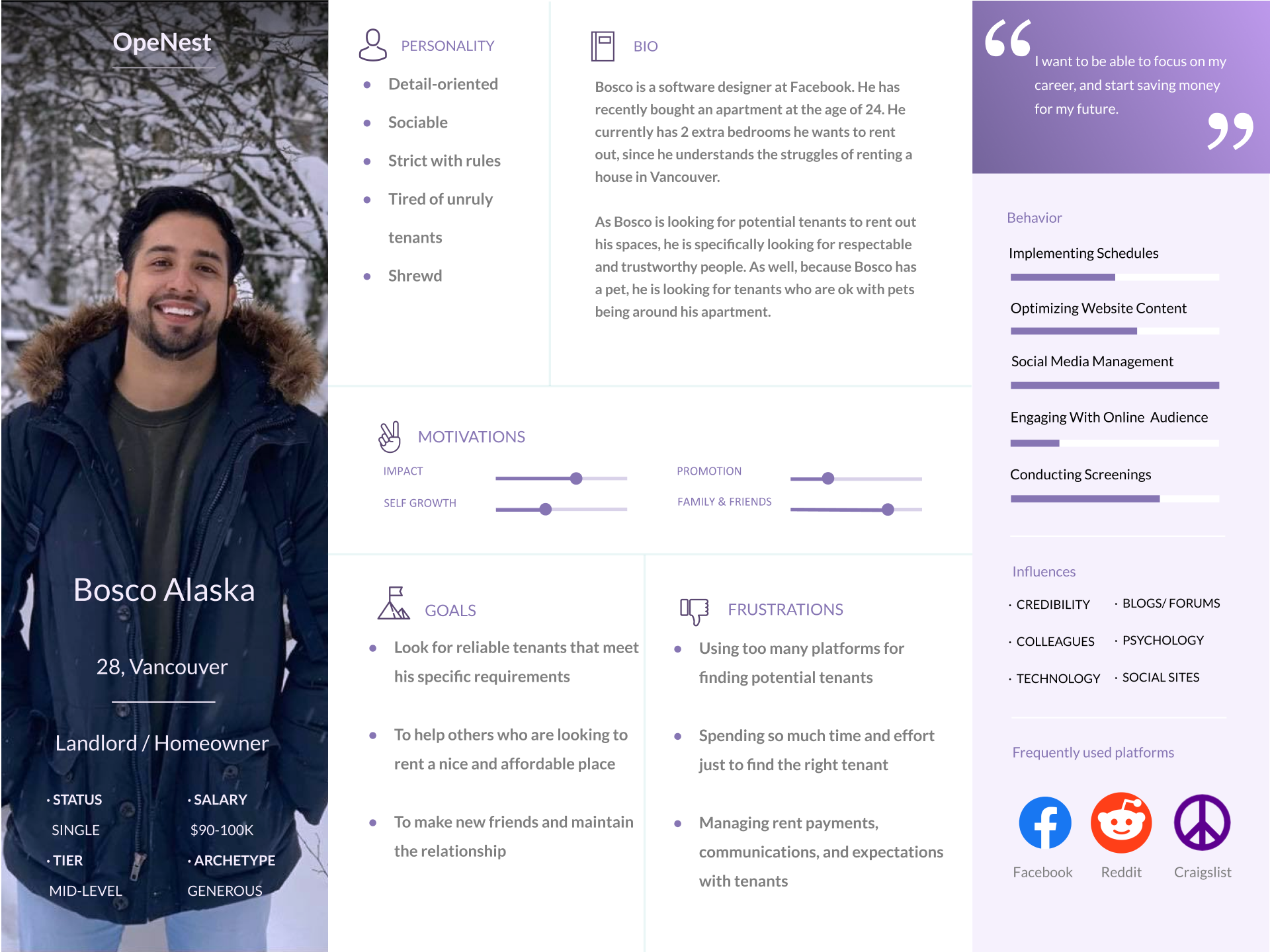
After analyzing our research, my team and I proceeded by creating personas. We felt it was absolutely necessary to have at least 2 personas for the reason being that our mobile application not only caters to people in need of a roommate but for tenants as well. The first persona we’ve created is reflected upon who we think our application would benefit from the most, which in this case are international university students. Our second persona reflects the other half of the equation which should technically be the landlord or homeowner.
Market Research
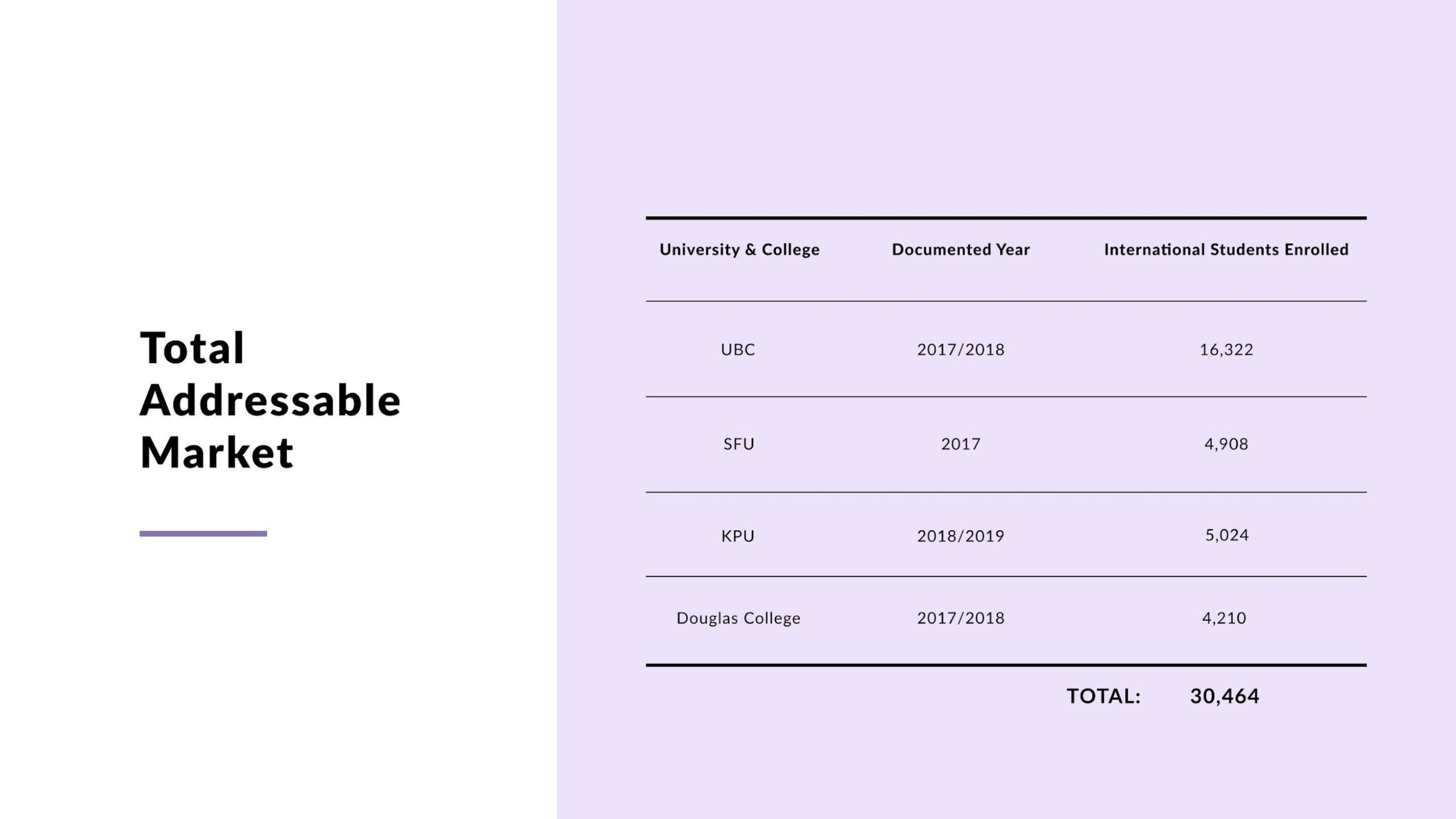
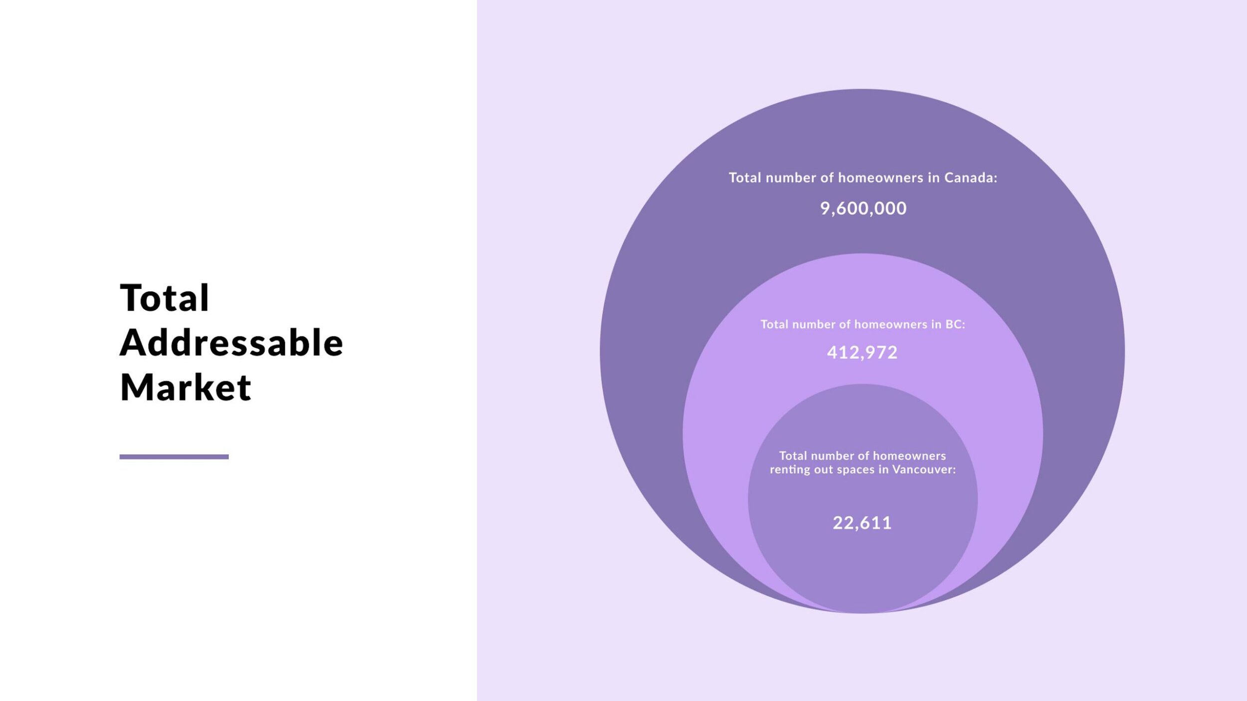

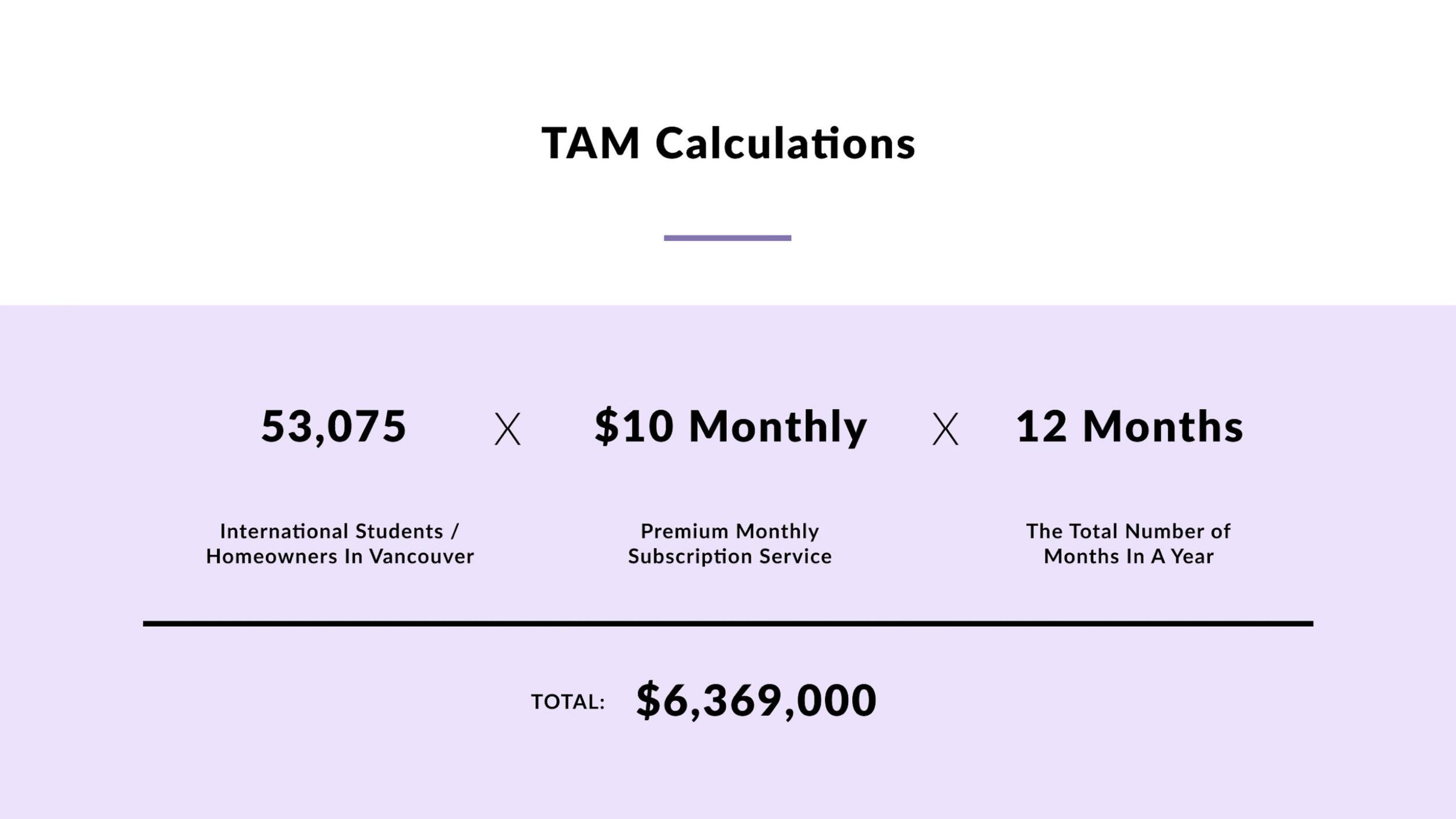
With some thorough research, my team and I were able to get a rough estimate of how many university students we could reach, and more specifically international students across 4 post-secondary schools. The number of people we could potentially reach came to a total of 30,464 international students alone. Moving forward, we also took the total number of homeowners in Canada and scaled it down to the number of homeowners in Vancouver, giving us a total of 22,611 people that may find our application useful.
Our Solution
Opportunity Fest 2020 Video Pitch
During this Opportunity Fest, my team and I had the opportunity to pitch our project idea to several different stakeholders and judges. We were specifically put into the category of Business & Lifestyle, where we competed with many other students from business and the health change labs. Overall, it was a great experience as my team and I even won second place in our category and received a lot of great feedback from the panel of judges.
Wireframe Sketches
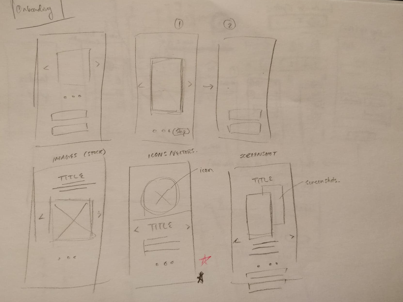
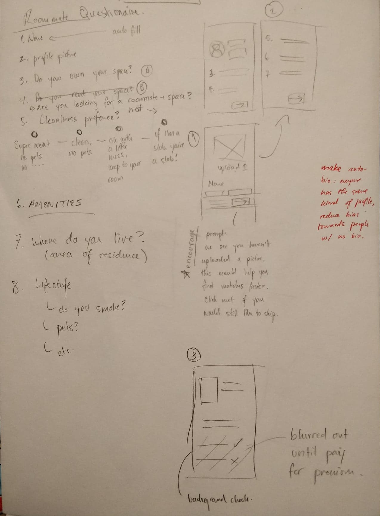
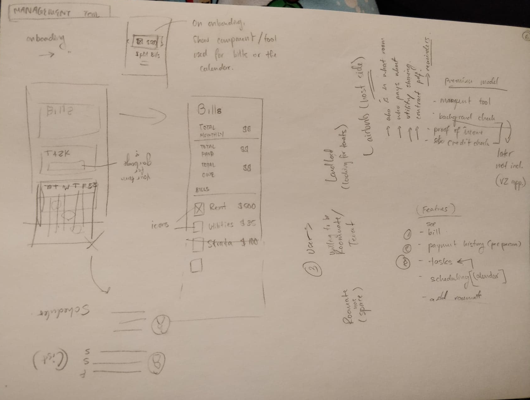
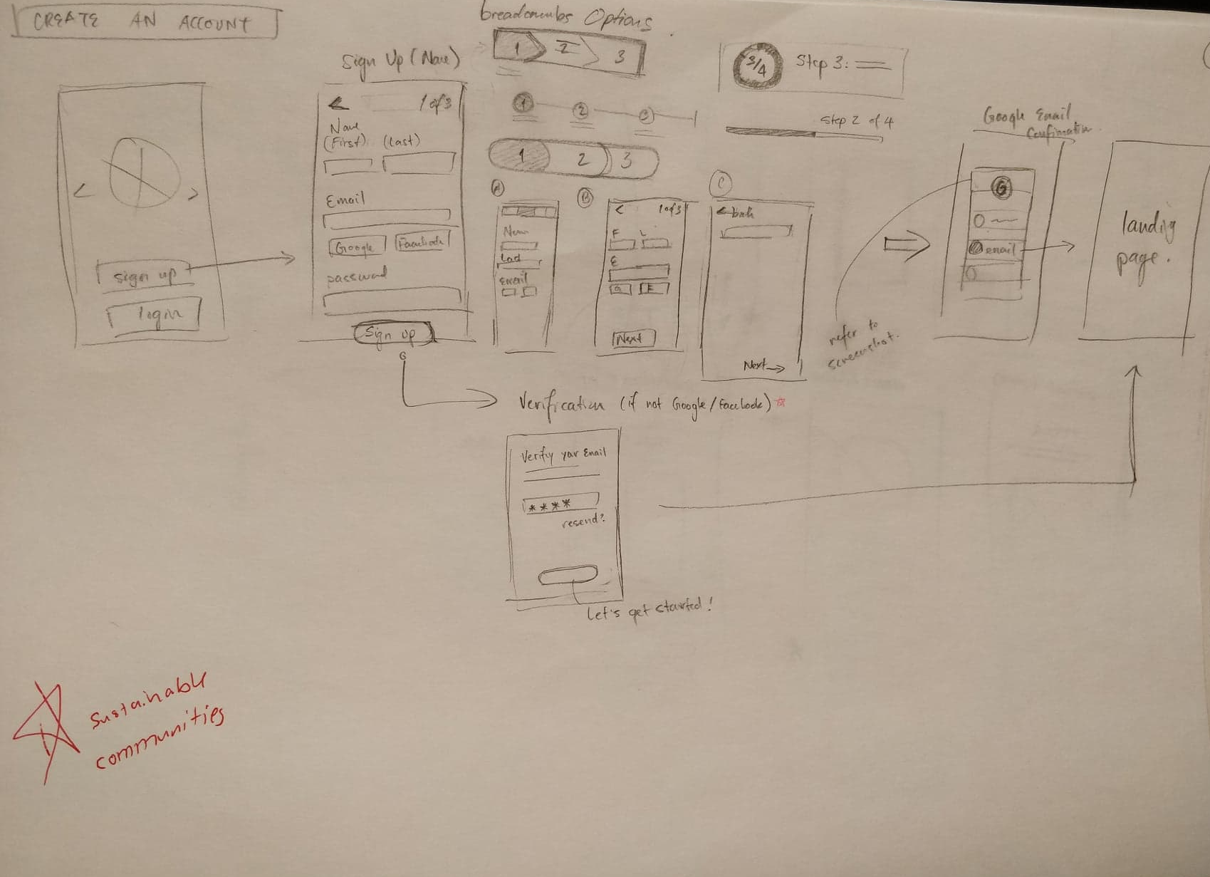
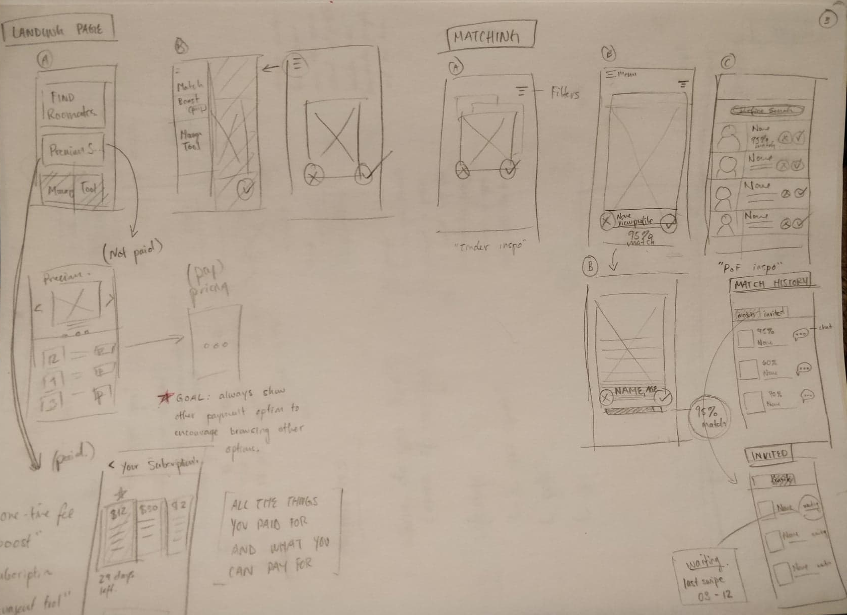
Although I was the only designer on my team, I was still able to bounce ideas off my other team members and peers. Because of this, I was able to communicate my ideas more efficiently while still thinking about key user experience principles with the user at hand. In short, we were able to transition these sketches into final mock-ups that also have some interactive elements.
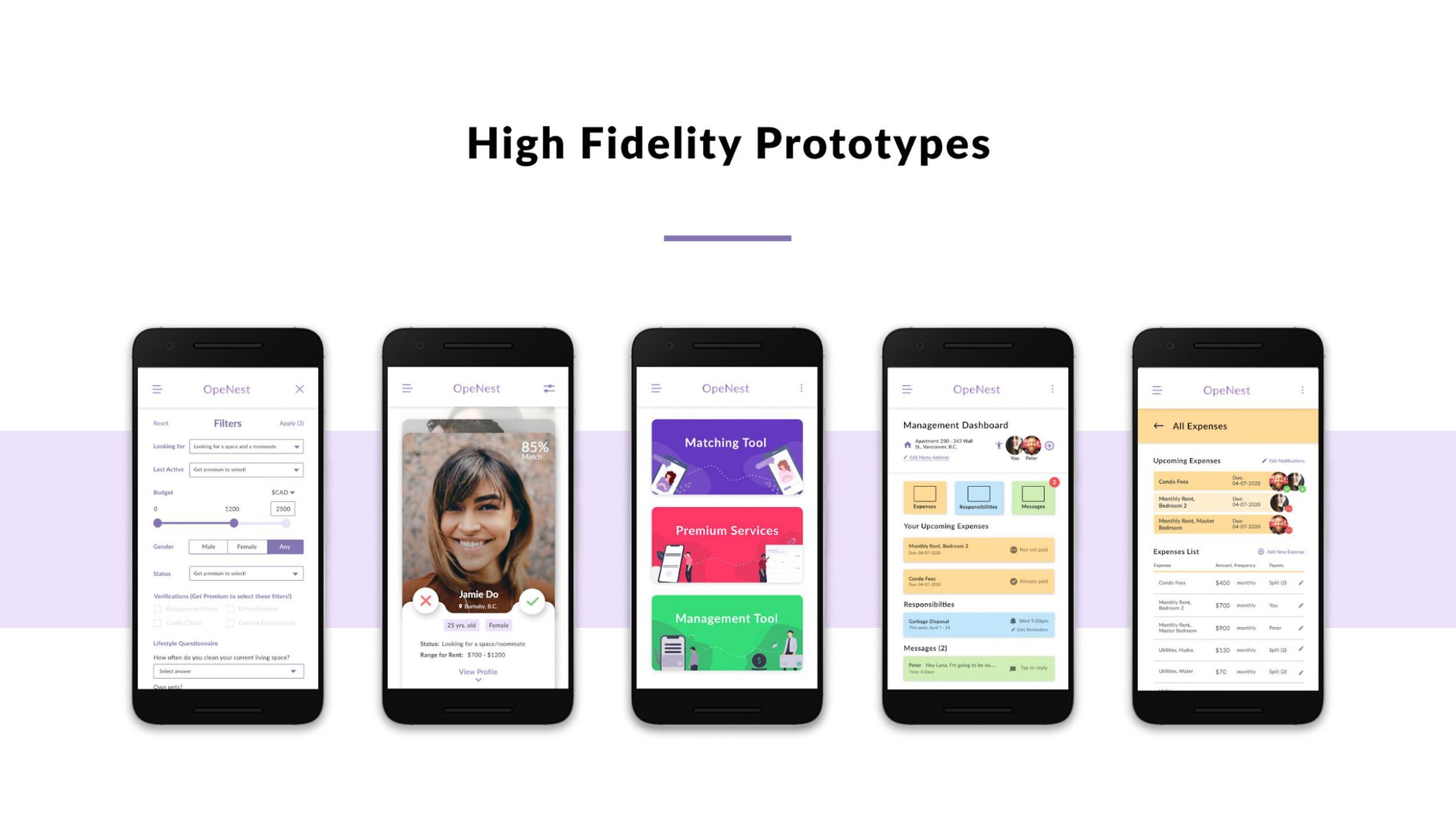
Final Mockups
While creating these high-fidelity prototypes I thought about what values my team and I wanted to provide for our users/customers. These values include providing convenience so that they can save time and be less frustrated while looking for a roommate, as well as keeping it simple and allowing for quick and easy accessibility that still caters to our users’ needs.

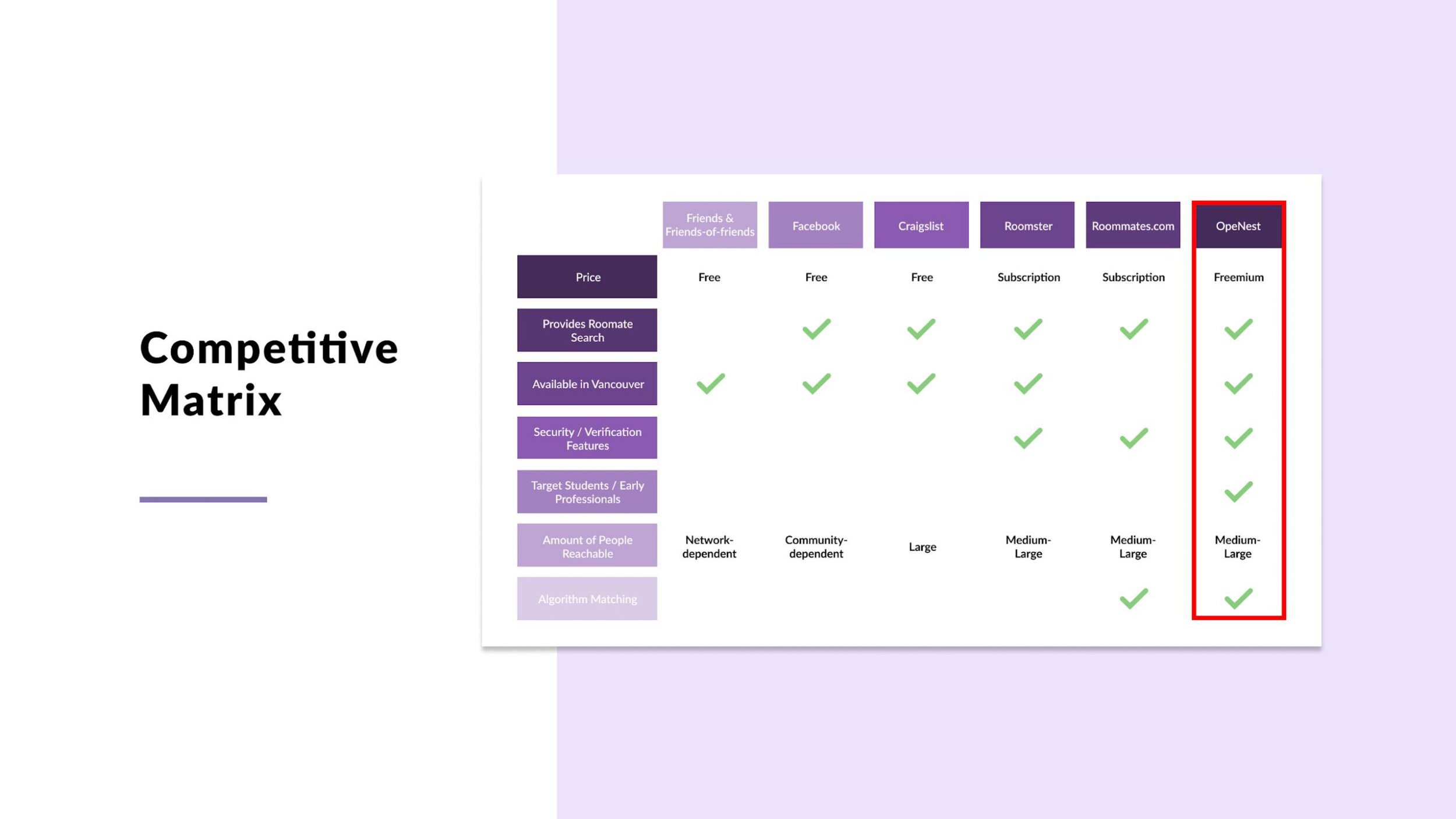
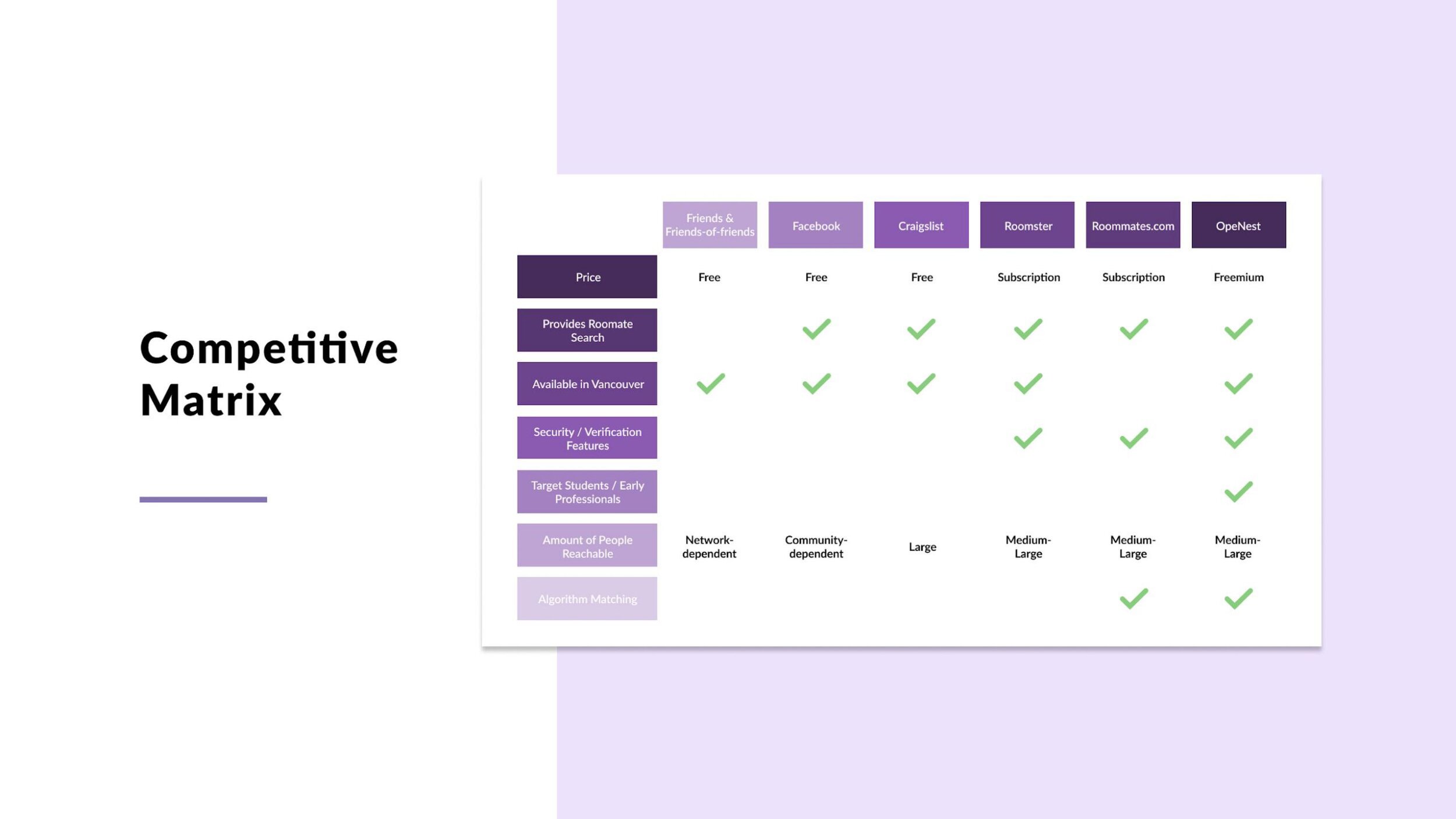
Going up and beyond, our team also created a competitive matrix to show the difference between what our application/platform offers when being compared to other existing ones. We realized that our mobile application was providing more value and this gave us more confidence to really pitch our idea during our final presentation as well as Opportunity Fest.
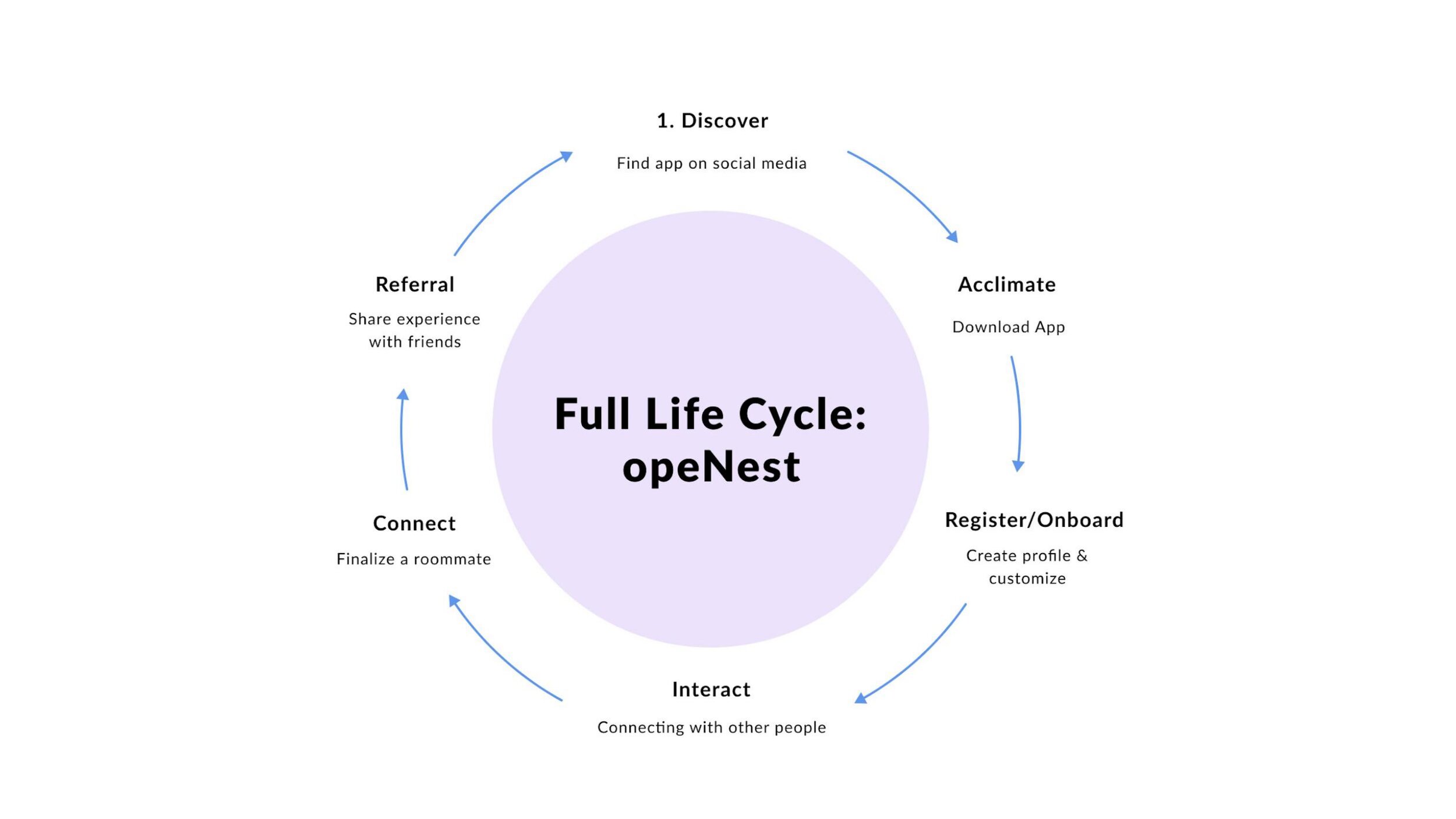
Full User Life Cycle
To present the idea of how our application can sustain itself, we to create a full user life cycle:
The user will first discover us through social media advertisements
They’ll then be able to download our application via Google Play Store or Apple App Store
Once download our app they will receive an introduction showing what the app can do
After being onboarded, they can begin to engage with the matching process
As soon as they find matches, users can start communicating and finalizing their terms
Lastly, after a month, they’ll have the option to rate their experience and refer us to others
Challenges
One of the biggest challenges I faced while working on this “business project” would have to be not having any designers on my team to bounce ideas off of. That being said, it was really great to receive feedback on the actual interface of our product from another perspective. How I overcame this was by effectively communicating some of the rules and principles to my business team, showing them what could be achieved and what was unrealistic in terms of development standards. Moreover, my team was also very open to getting other designers and their perspective of the designs as well as the project as a whole, and we received more than enough feedback where we as a team could incorporate their critique to better improve our designs and project overall. My main takeaway from this is that, even though I did not have other designers on my team, it doesn’t mean that they aren’t able to still help and that even getting their business perspective has opened my eyes to things I could have missed as a designer as I’m seeing the project through a different lens.
Final Thoughts
My experience overall with this project was definitely a memorable one, especially since it was one of the last projects I had to do before graduating from university. I also find it really refreshing to be working with a diverse group of people coming from different programs and faculties. Because of this, we were able to gain different perspectives from each other and really question the value we want to provide for our users/customers. Lastly, if there was one thing I could change or could have done if we had more time, it would definitely be to conduct some usability testings and have more iterations for our final mockups.
© John Latay 2021