


PROCESS
Timeline and functionalities

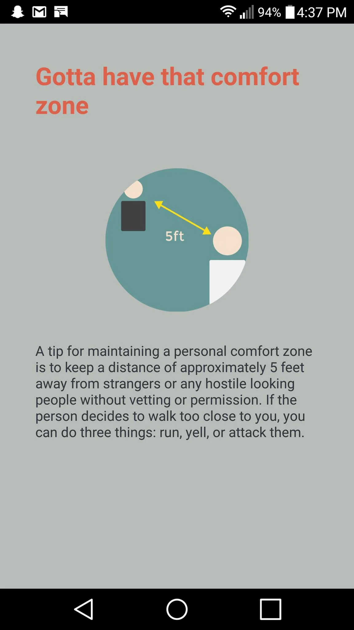
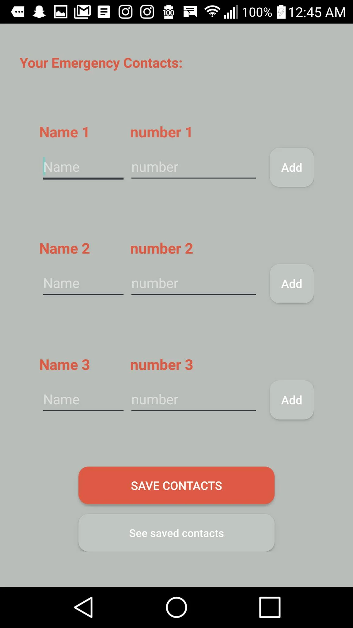
For this project, my partner and I were given the task of designing and developing a mobile application that had to have a basic functionality as well as a standard one. The basic functionality involves the use of shared preferences which we've implemented with the login and register page, having at least two to three sensors or hardware used such as the speakers, vibrator, and the built in GPS, as well as the implementation of a list view which we have included with our safety tips. As for the standard functionality, it includes the use of a geocoder which allowed us to convert coordinates into a street address, and also consists of an SQLite Database that helped us save contacts that were inputted by a user, and lastly the use of an SMS manager for sending out an emergency message with the user's specific location.
Digital prototype
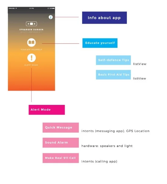
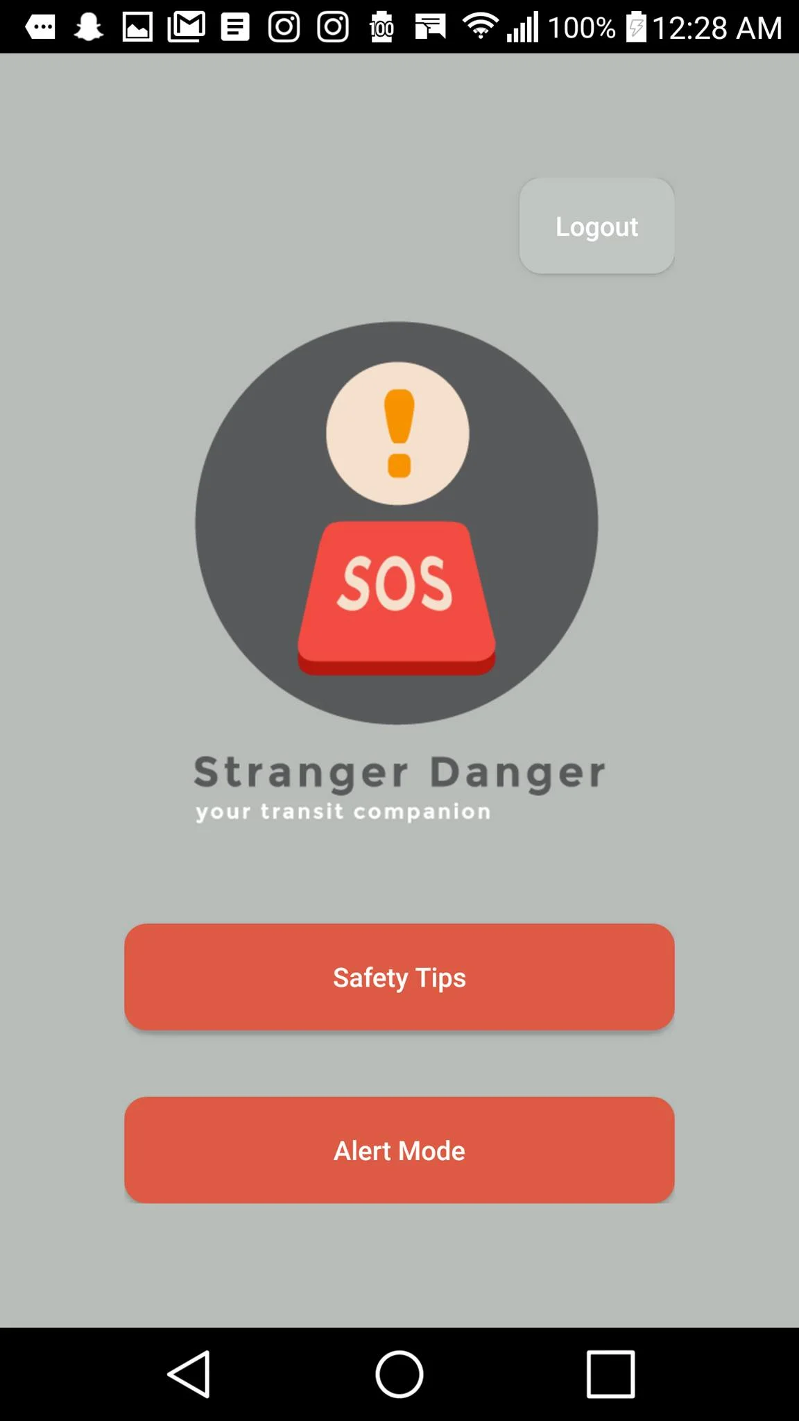
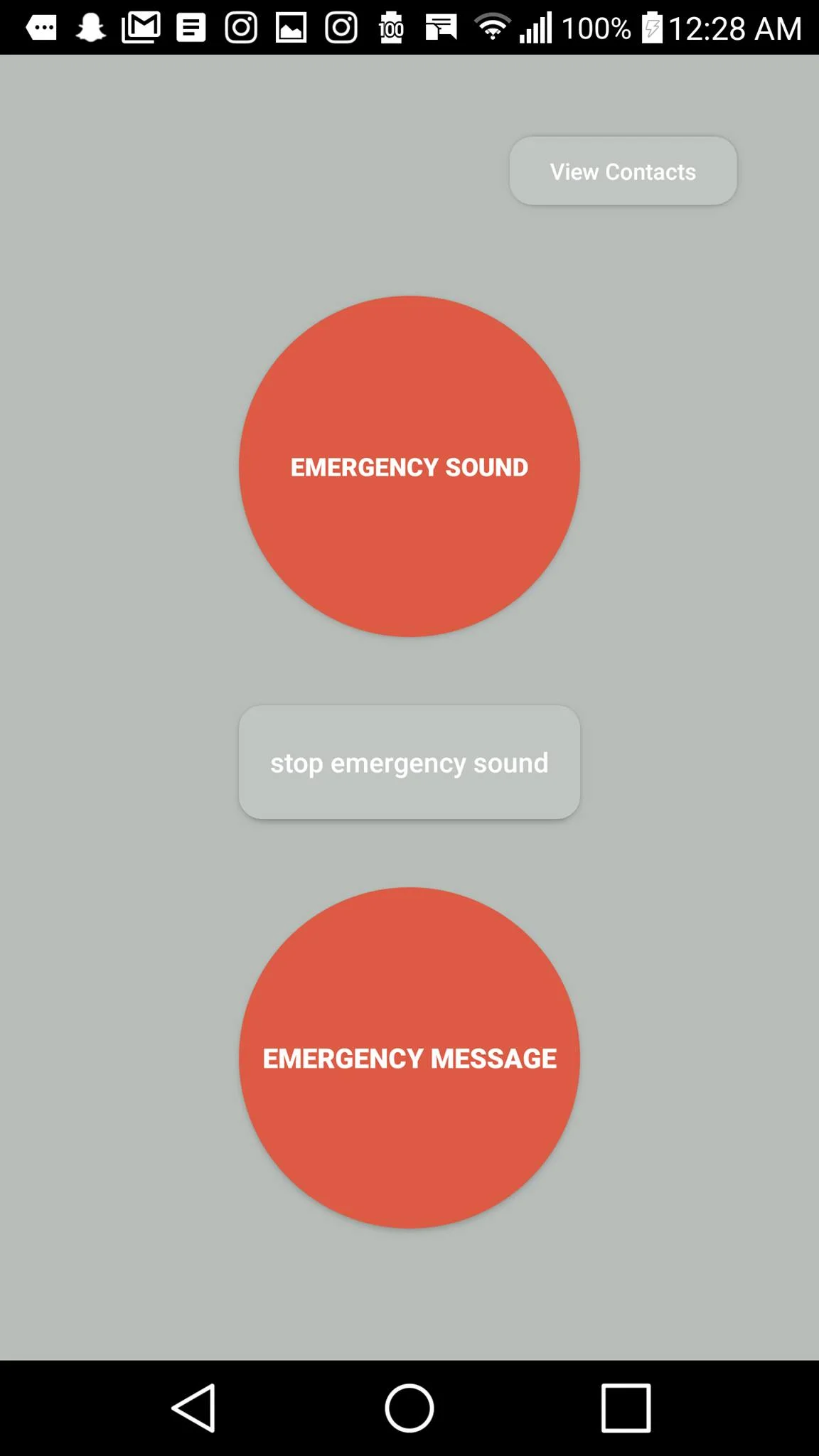
Our application has two main features: the safety tips that include general defense and first aid tips, and an alert mode where you would find an emergency button for playing long and loud distracting sounds that will direct attention towards you, as well as an emergency messaging system that sends a message to three contacts with the user's current location. Initially, my partner and I tried to have a minimalist approach when designing the layout for this application, as we went for a thin san-serif font along with warm and vibrant colours. After some iterations, we came up with a layout that took user experience into mind as our first initial layout was too bright on the eyes and a bit hard to read.
Sitemap and navigation
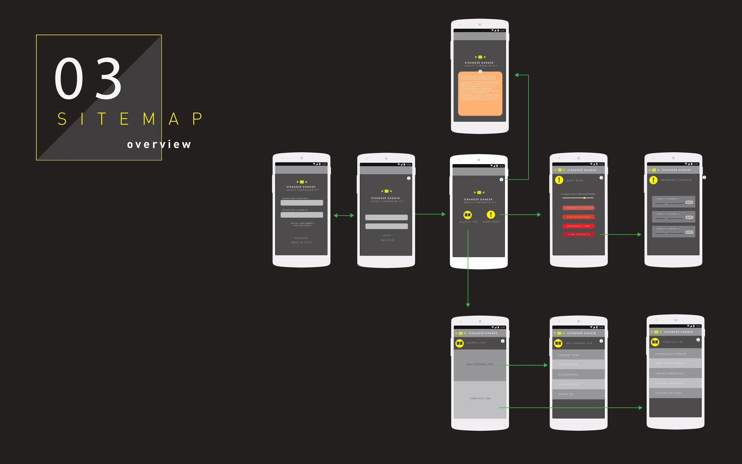
Before adding any aesthetics such as graphics or colour, it we necessary to create a sitemap because it shows how users would navigate through our mobile application. Additionally, it also helped with hierarchy in terms of what the main page would be after users have logged in, as well as what content or action needed to be prioritized.
Final Iterations
With all the iterations my partner and I made along with the critical feedback we got from our peers, we decided to focus more on the functionality while keeping using experience in mind. The reason for this was because this application is meant for people who feel scared travelling alone, by transit, and especially in the dark. In other words, the functionality was so important for this application as it would actually help users in real life situations where dangerous and unsafe things could happen to them or the people around them.
Final Thoughts
After having created this mobile application and getting to work with android studios for the first time, I feel like our project was received really well by our professor and peers. Many who have actually tried our application, have said that it would be really useful to have when travelling alone at night, and that the location when the emergency message is sent super accurate. Hearing these comments really changed my perspective on how projects should be approach as well as how decisions could be made, and because of that I was able to learn more about user experience. The only changes I would have made if given more time is the addition of more graphics, but overall I was very happy with how the project turned out, as it is something even I would use myself.
Stranger danger (Mobile design)
Stranger Danger is a safety travelling companion specifically designed and developed for mobile users. It provides two main features which consist of general safety tips, as well as an alert mode for emergency situations. The main purpose of this app was to make travelling via transit feel more safe. Through the use of android studios and adobe illustrator, my partner and I were able to complete this fully functioning application from ideations to prototypes and to the final product.
TYPE: Team project (2 people)
ROLE: Ideator, Developer, Prototype Design, Presentation Design, Content, User Interface Design.
Year: 2016